Interior Design Color Palettes
Explore paint colors, material pairings and room examples before you commit to a palette.
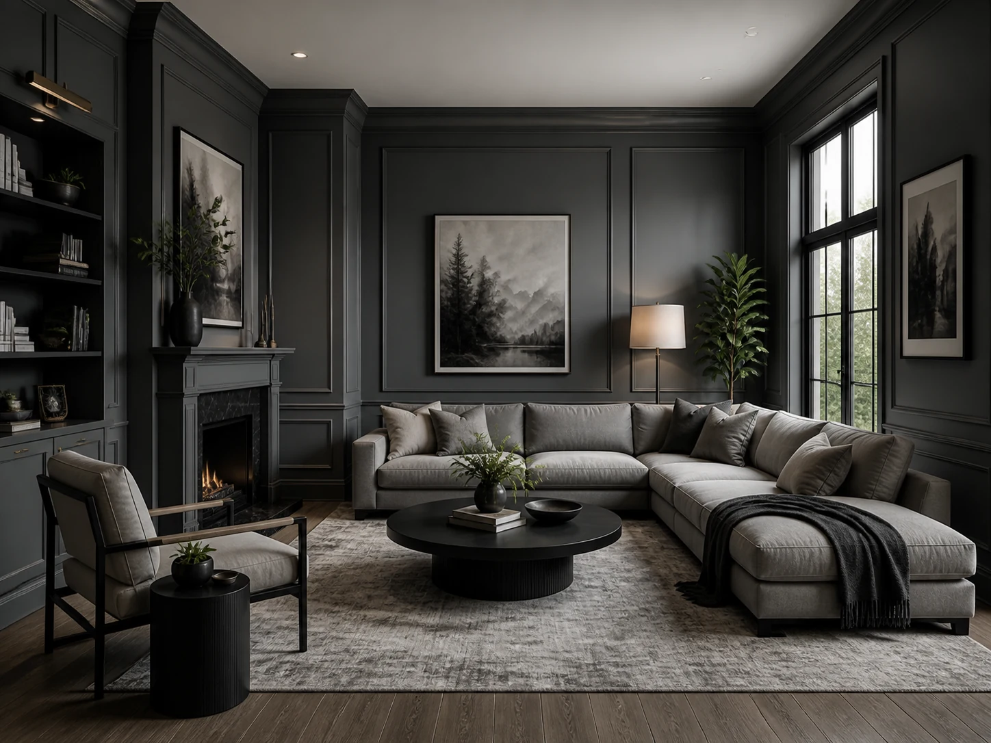 Warm Gray
 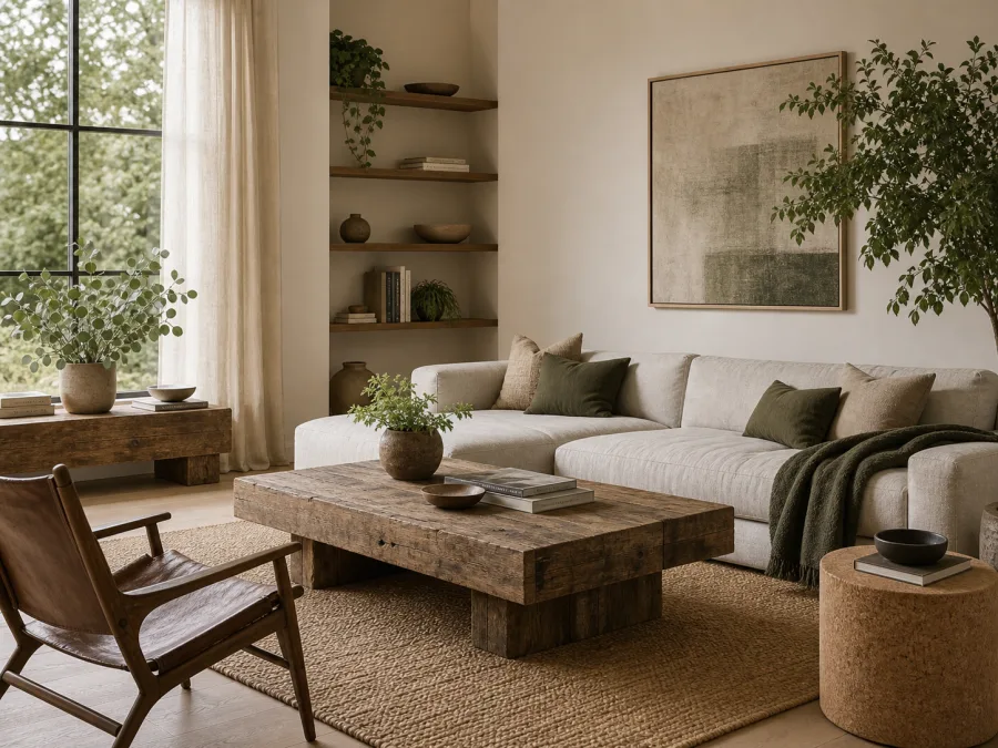 Sage Green
  Black & White
 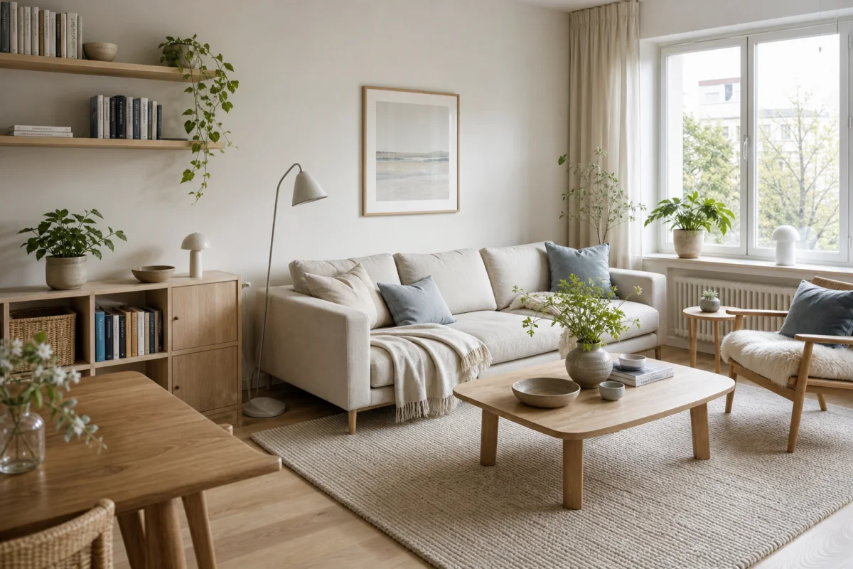 Warm White
  Soft Retro
 Featured color palettes
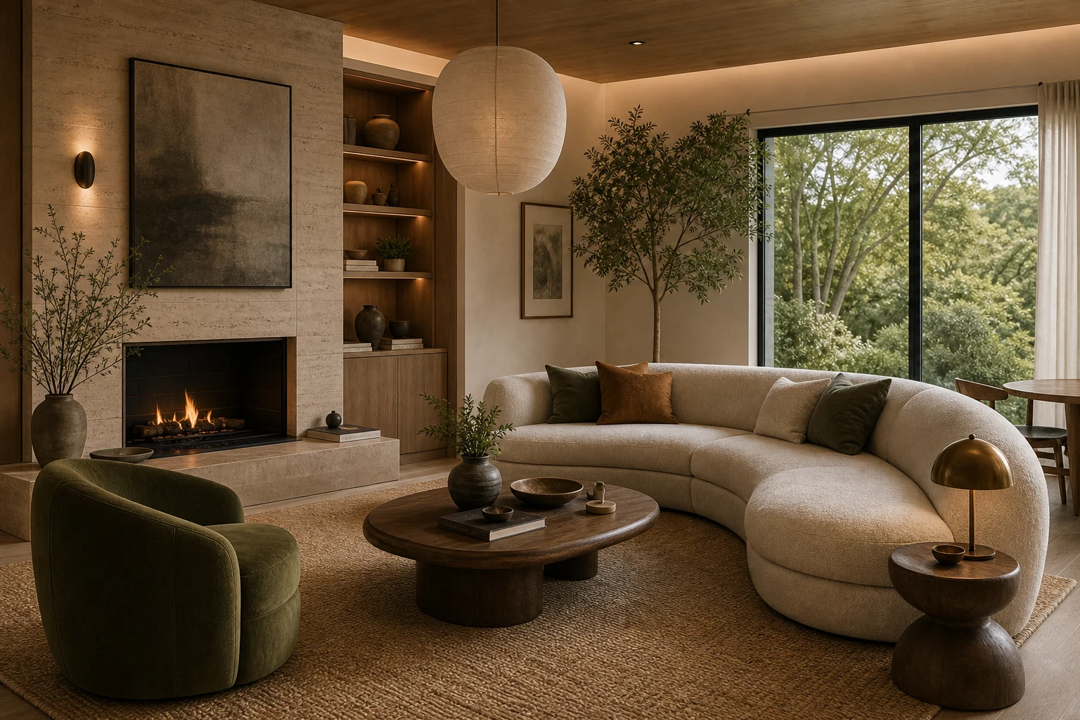
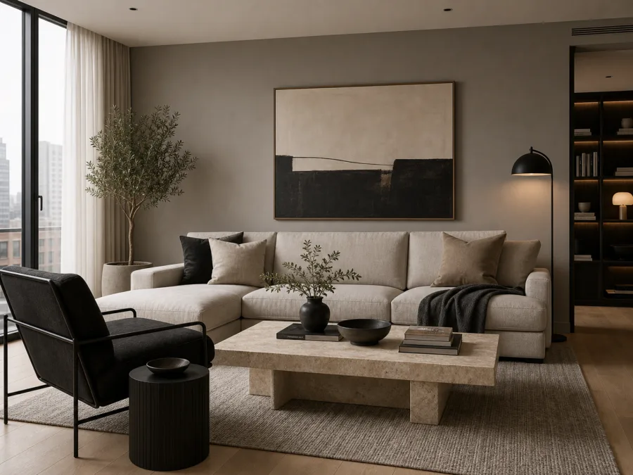
Warm Gray Interior
A soft neutral palette for calm rooms with stone, linen and black accents.
Living rooms, bedrooms and offices that need calm without feeling cold.
Keep walls warm, then use charcoal only for frames, lighting or small furniture.
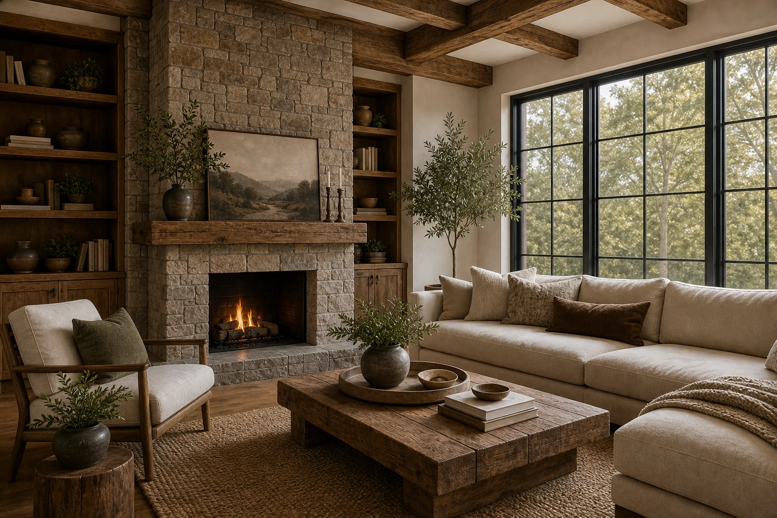
Sage Eco Modern
Earthy greens and warm neutrals for a natural, sustainable feel.
Rooms with plants, recycled materials, linen, jute and visible wood grain.
Let green act like a natural accent, not a theme. Repeat it in plants, textiles and art.
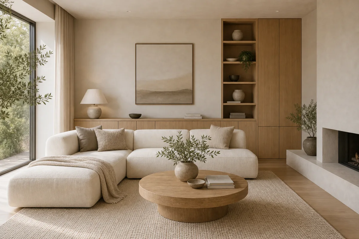
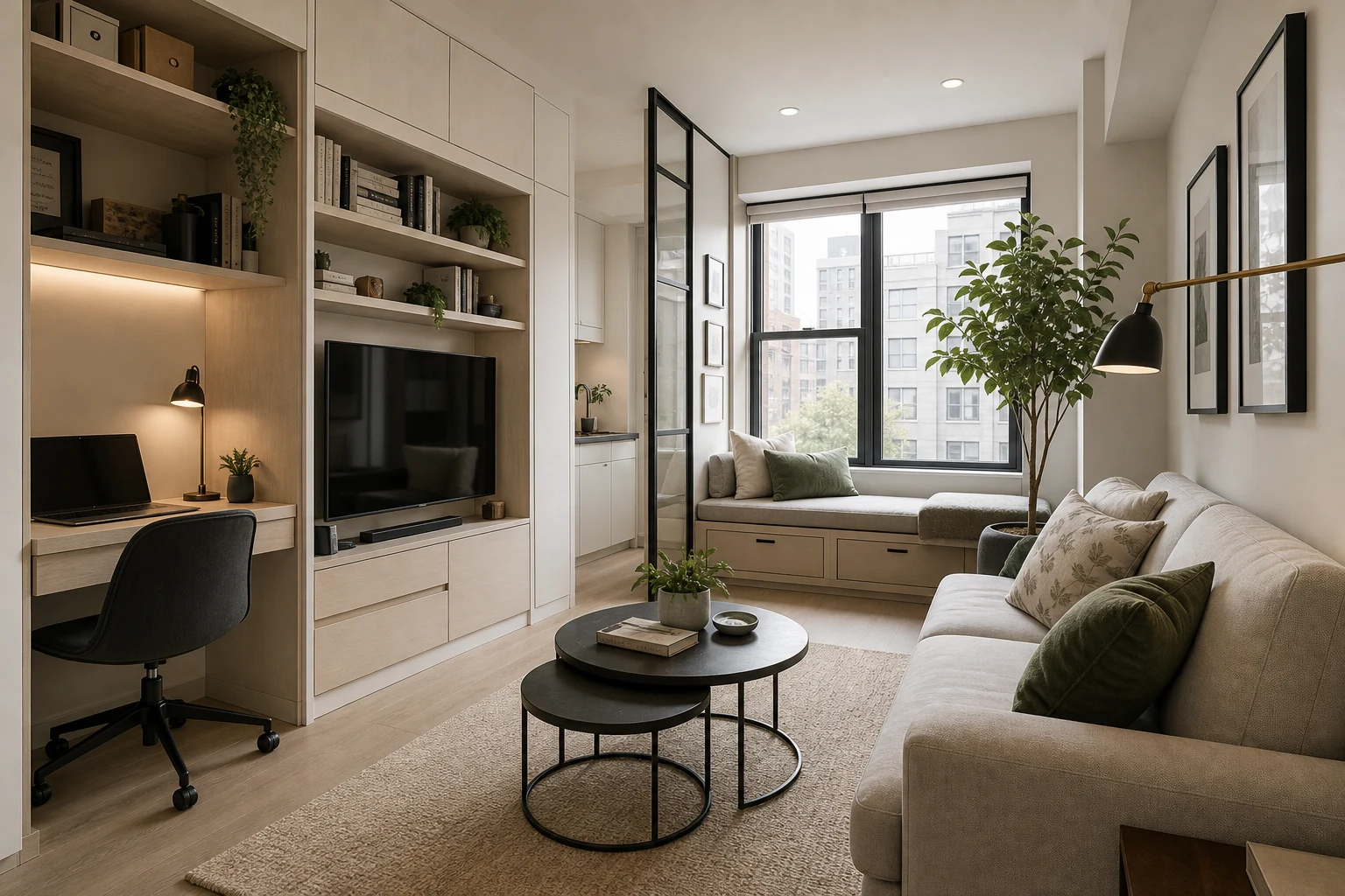
Warm Minimal
Creamy neutrals and light wood for a bright, uncluttered look.
Small spaces, bedrooms and quiet rooms where storage matters more than decoration.
Use one pale base, one wood tone and one soft contrast so the room feels edited, not empty.
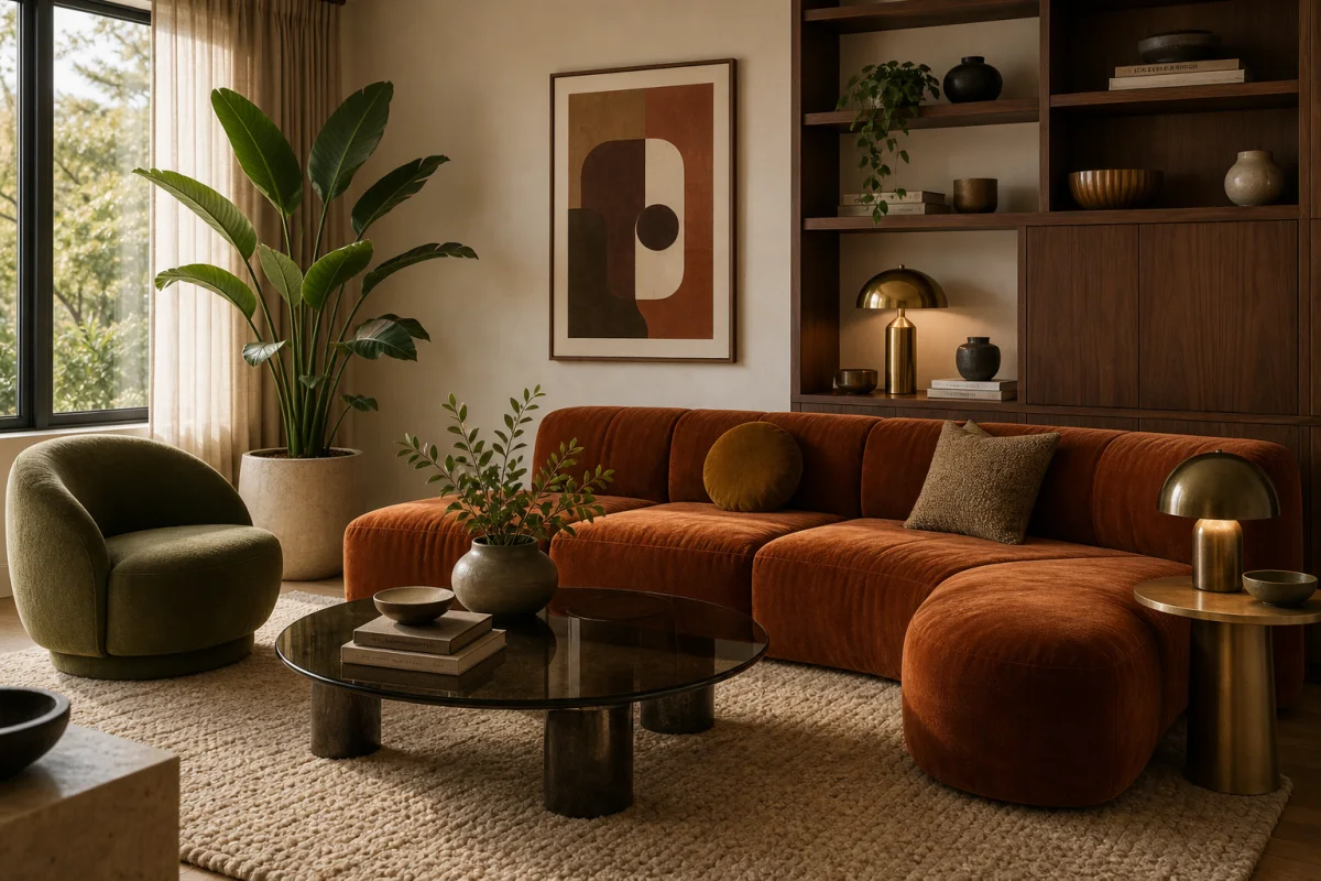
Soft Retro
Warm 70s-inspired tones with mustard, rust and cream.
Relaxed living rooms, dining rooms and dens that can carry richer color.
Pick one dominant retro color and keep the walls quiet so the palette feels current.
Monochromatic
Layered grays from soft to deep for a quiet, modern room.
Contemporary rooms with strong silhouettes, stone, black metal and good light.
Vary texture more than color: plaster, wool, stone, metal and matte ceramics do the work.
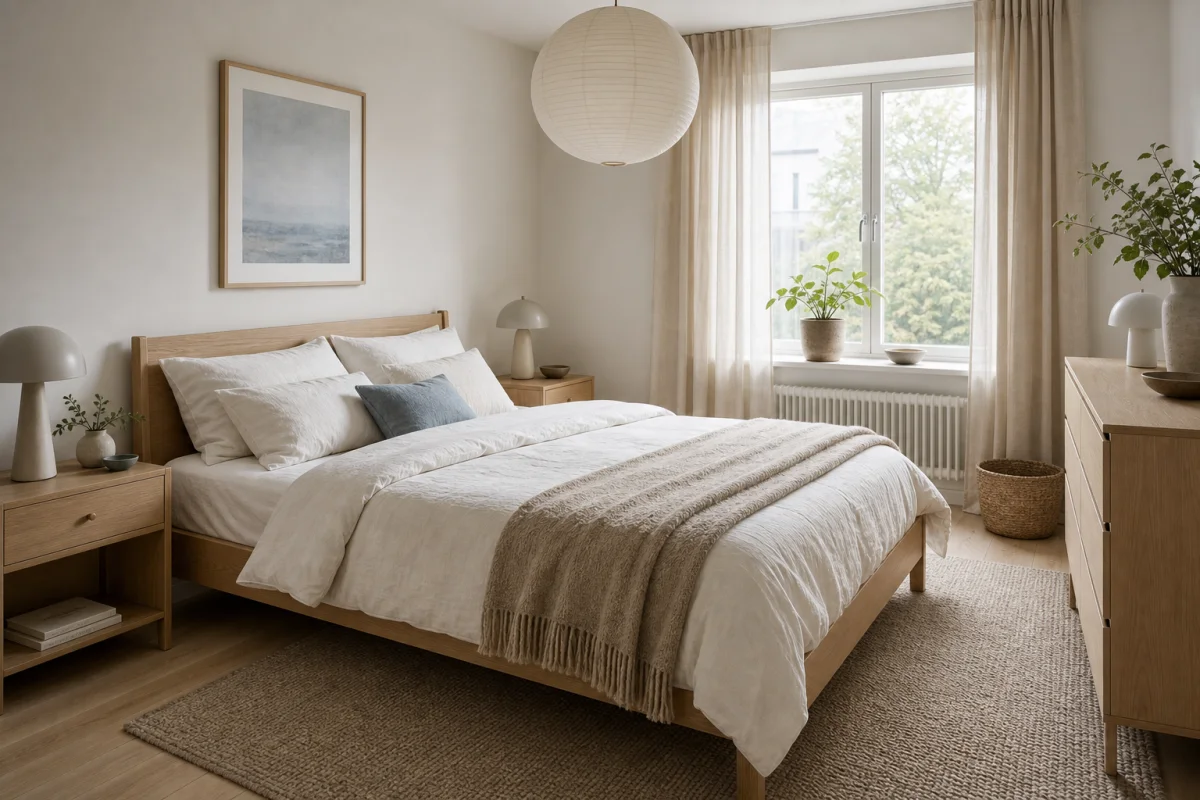
Pastel Interior
Gentle blush, sky and sage pastels for a light, airy space.
Bedrooms, kids rooms and small rooms where softness matters more than drama.
Ground pastels with greige, pale wood or soft gray so they do not feel sugary.
A simple way to build a room palette
Use color as a hierarchy. Big surfaces should be easy to live with, materials should carry warmth and texture, and accents should repeat with intention.
Walls, ceiling, large rugs and sofas. Choose the color you can live with across the biggest surfaces.
Wood, stone, tile, cabinets or upholstery. This layer decides whether the room feels warm, cool, light or grounded.
Art, pillows, lamps, ceramics and hardware. Use this layer to repeat a color, not introduce five new ones.
How to choose an interior color palette
Observe how light moves through your room. North light is cooler, south light is warmer. Let that guide your palette.
Pull a key tone from something you love — wood, stone, tile or fabric — and build your palette around it.
Mix warm and cool hues so the room feels layered and timeless, not too yellow or too blue.
Try your colors together on the wall. Check them at different times of day before you commit.
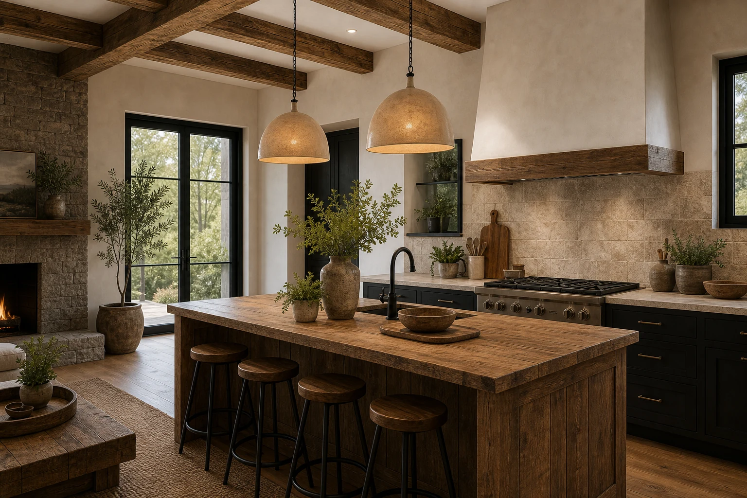
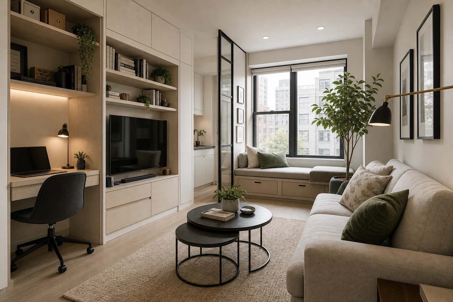
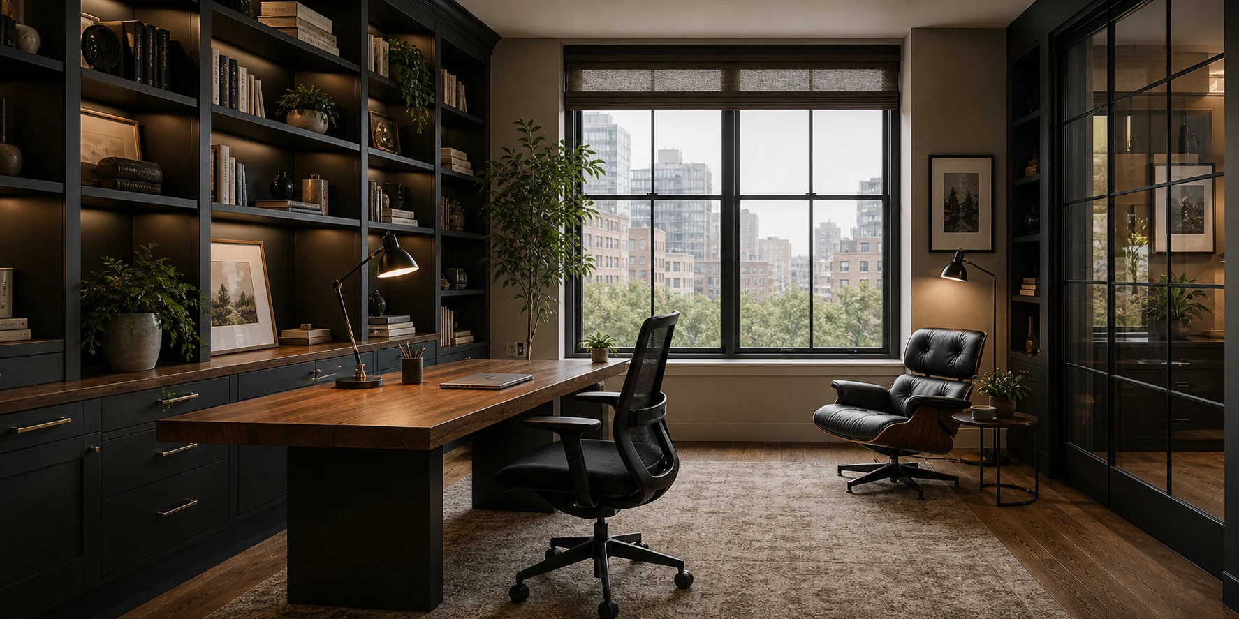
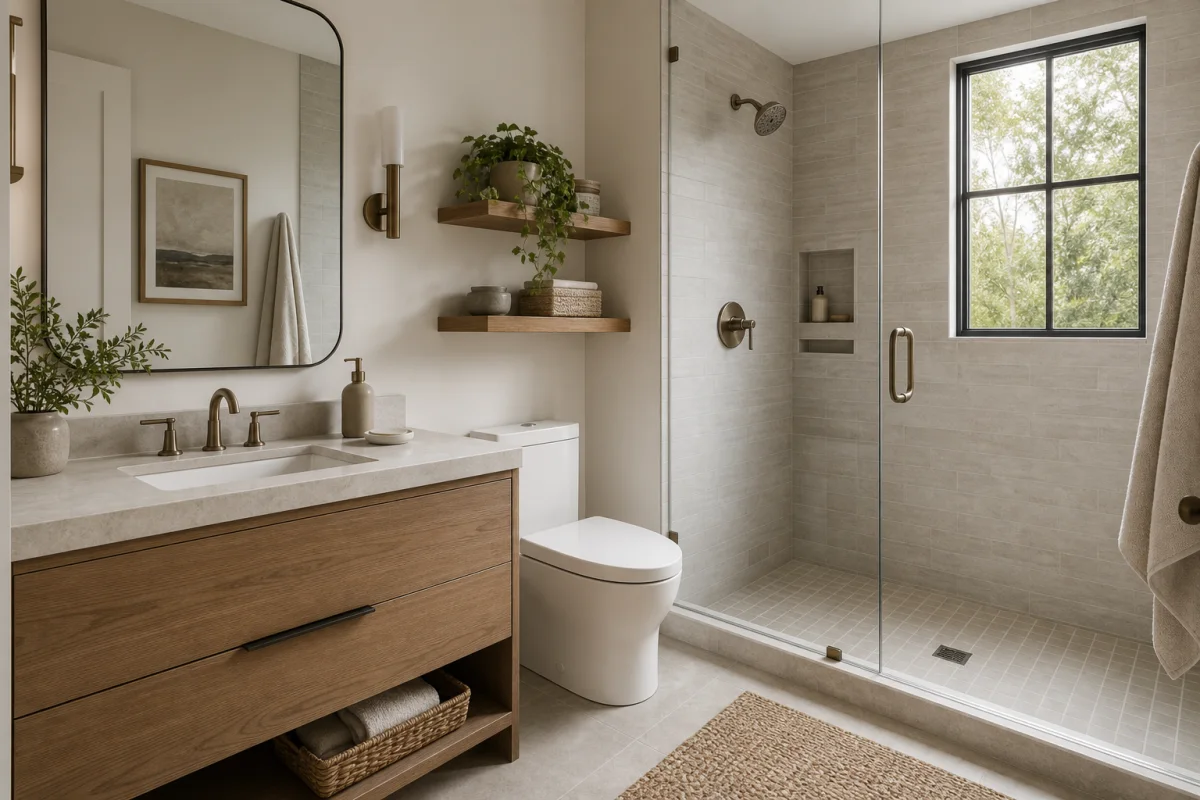
Palette ideas by room
Common color mistakes
Most palette problems come from undertones, lighting or missing contrast. Use these checks before buying paint or furniture.
Wood, stone and fabric already have undertones. Pick those first, then choose paint that supports them.
All-warm rooms can look yellow, all-cool rooms can feel flat. Mix a warm base with one cooler balance point.
A room needs light, medium and dark values. Without contrast, even a good palette can look unfinished.
Paint changes from morning to evening. Test samples beside flooring, furniture and window light before committing.