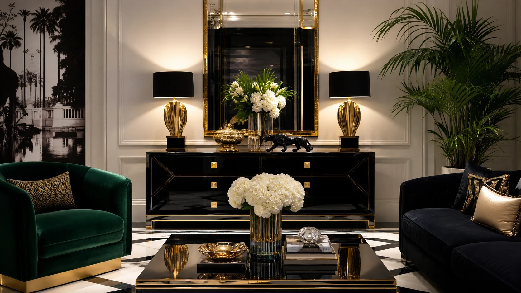
Lacquered console
Choose one polished anchor with closed storage and enough wall space for a mirror or artwork above.
Rooms staged for a memorable first impression, using lacquer, mirror, saturated textiles and oversized art while comfort stays firmly in the leading role.
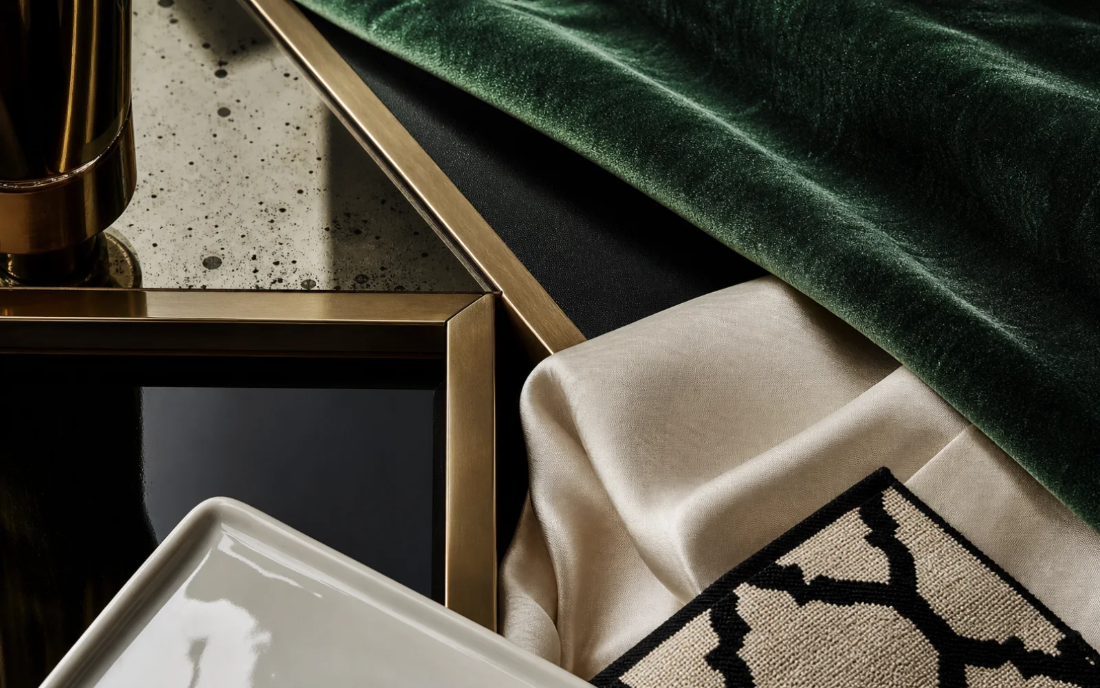
Hollywood Regency is a theatrical decorating style shaped by the glamour of cinema’s golden age. It mixes classic room architecture with lacquered furniture, mirrors, silk or velvet, bold black-and-white contrast, statement lamps, palms and art chosen for visual impact rather than strict historical purity.
The style is deliberately eclectic: a classical chair may sit beside a modern lacquer desk and a large photographic print. What holds the mix together is a controlled palette and a clear focal scene. Livable rooms also need matte upholstery, closed storage and empty visual space so every reflective object is not competing for attention.
Choose the first view from the doorway and organize mirror, art, lamps and furniture around that moment.
Furniture shapes may vary, but two or three recurring colors keep the eclectic composition intentional.
Place reflective surfaces where they multiply light or a composed vignette rather than doors, cables or storage.
Oversized art, a dramatic light or a polished console creates a view with immediate impact.
Ivory and black establish graphic clarity while emerald, aubergine or oxblood supplies cinematic color.
Lacquer, antiqued mirror, ceramic glaze and polished metal respond differently to light.
Classical, modern and exotic references coexist when silhouette and color roles are carefully assigned.
Build one console-and-mirror vignette, then keep the main sofa matte and comfortable to absorb the surrounding shine.
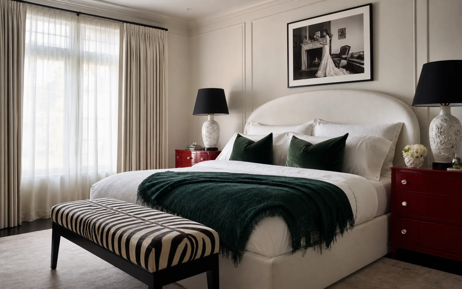
Use paired lacquer chests and lamps for drama, balanced by an ivory bed and simple full-length curtains.
Combine one theatrical pendant, saturated curtains and a dark round table; let chair upholstery remain pale.
Confine gloss to the desk and selected shelf backs so screen glare and visual clutter remain controlled.
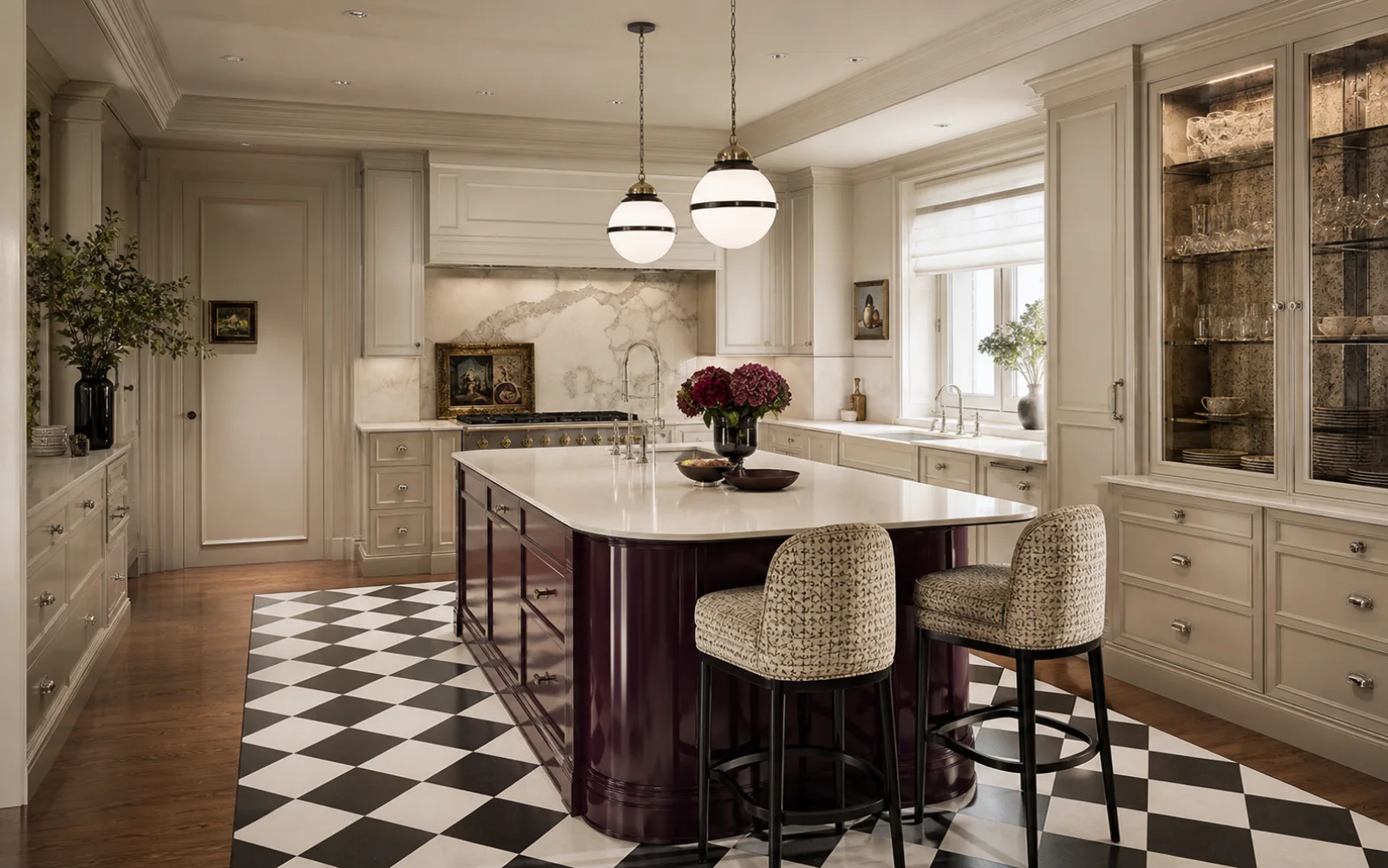
Put high-gloss color on the island, not worktops, and use mirror only inside a display cabinet.
Treat the first wall as a set piece with console, lamps and mirror while concealing coats nearby.
Begin with ivory and one dark anchor, choose a single jewel color, then repeat it across no more than three elements. Metal and mirror should frame the palette rather than become colors themselves.
A luminous neutral backdrop for darker silhouettes and reflective accents.
A graphic lacquer note for one table, console or door rather than every case piece.
A saturated textile color that holds its depth beside black and mirror.
An alternative to black that adds richer color to a desk, island or cabinet.
Use as a fine frame and warm highlight, never the room’s largest surface.
A deep polished finish creates a strong focal object; broad matte neighbors keep it legible.
Different piles and weaves give saturated color changing depth from day to evening.
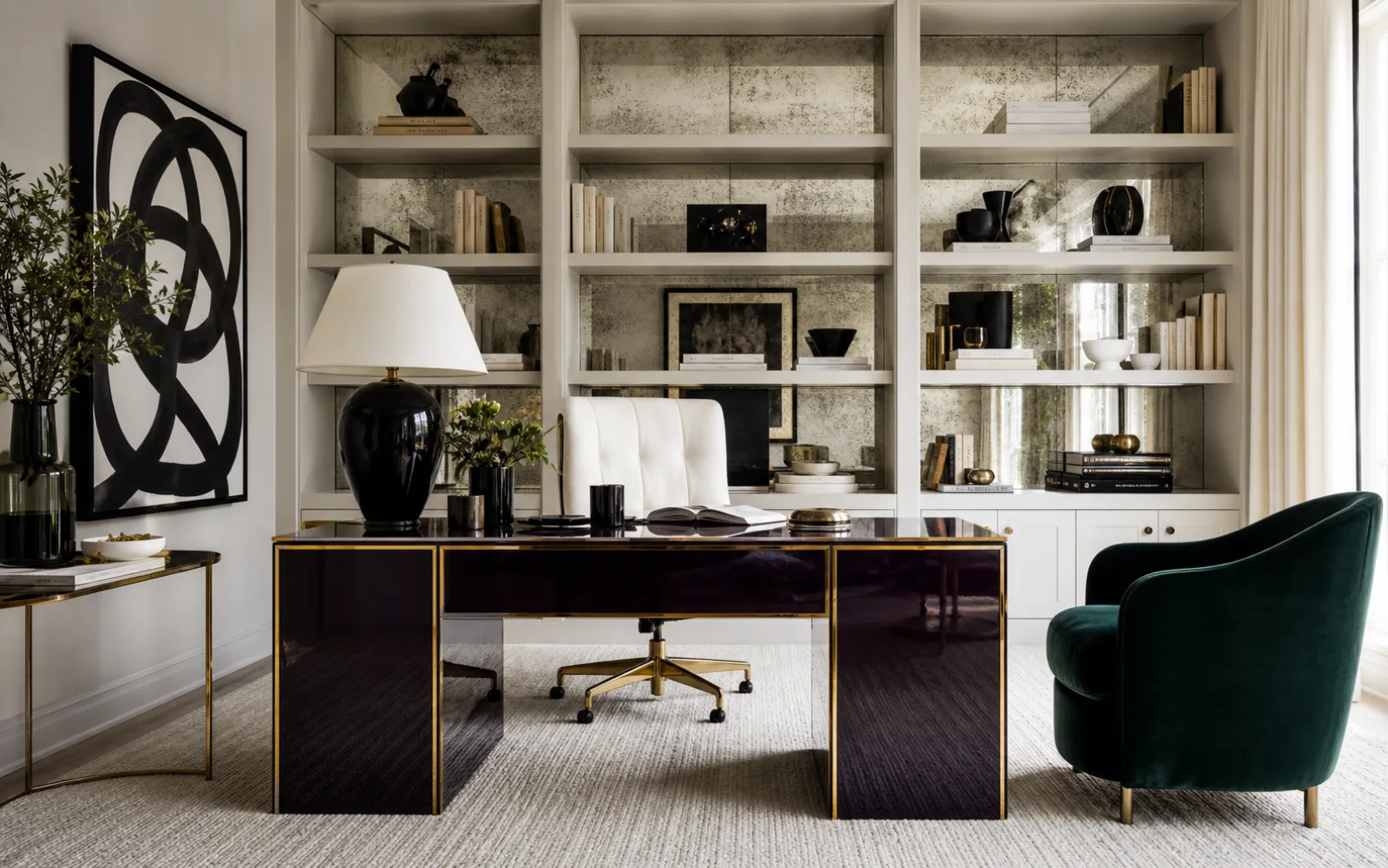
Mottled reflection adds atmosphere and disguises the utilitarian contents of selected niches.
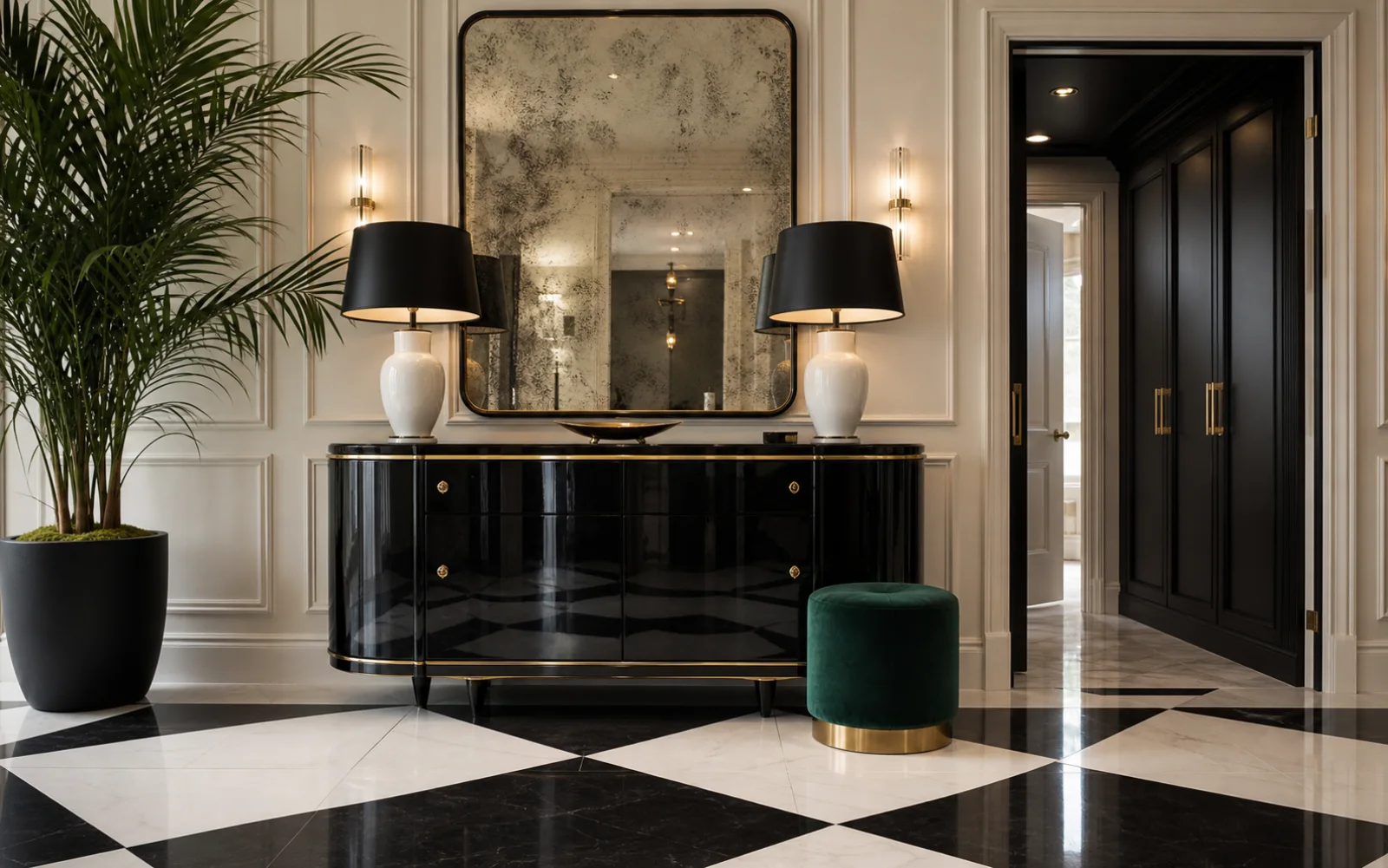
Opaque glaze and a narrow metal line create a classic lamp with strong graphic presence.
Think in views, not in shopping categories. Plan the first visual scene, decide where gloss will catch light, then make the rest of the room support daily use.
Stand at the main doorway and select the wall or grouping that should deliver the first impression.
Pick one lacquered object, one expressive light or artwork and one saturated textile family.
Map what each mirror and glossy plane will show in daylight and after lamps are switched on.
Add comfortable upholstery, wool rugs, closed storage and quiet walls around the theatrical elements.
When the room feels wrong, change the underlying decision before adding more decor.
Keep one lead, two supporting accents and let remaining furniture recede.
Remove themed photographs, figurines and novelty props; retain useful furniture with strong silhouettes.
Reduce mirror and lacquer, then add matte wool, linen and painted surfaces.
Introduce aubergine, oxblood or emerald and use ceramic or nickel as a contrasting finish.
Hollywood Regency shares glamour with nearby styles but remains the most scenographic: its room is composed for impact through contrast, reflection and selective eclecticism.
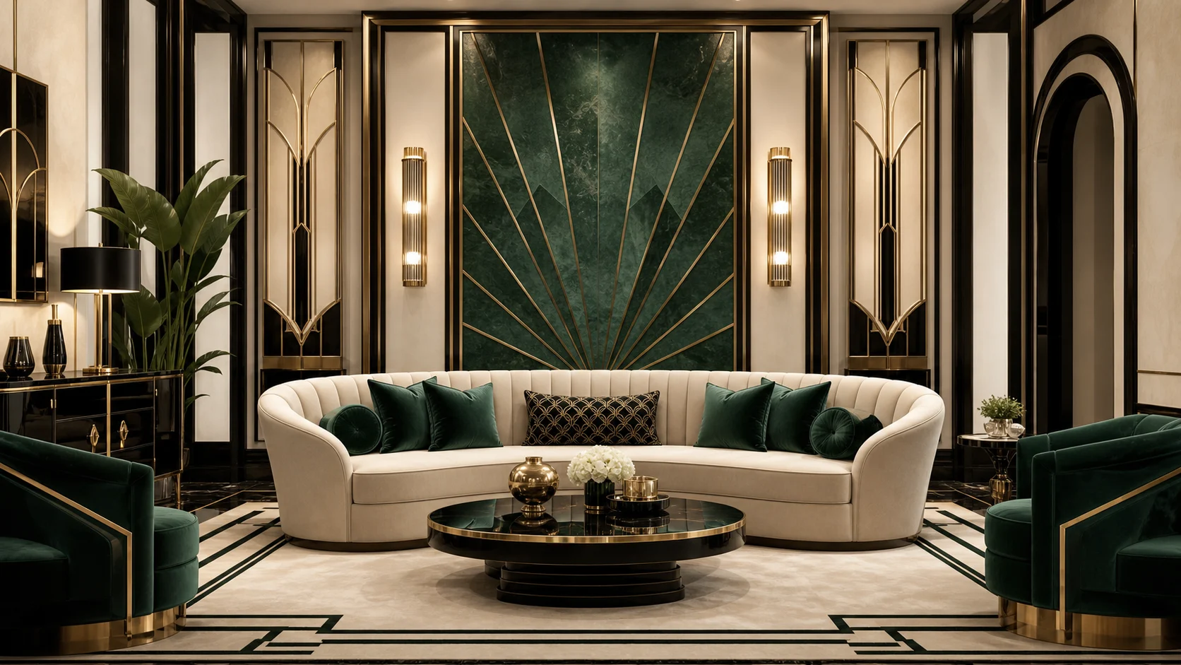
More geometric, axial and disciplined through stepped forms, veneer and machine-age craft.
Choose Hollywood Regency when theatrical styling and an eclectic mix of eras matter more than geometric purity.
Scenic vignettes and mixed silhouettes replace repeated formal geometry.
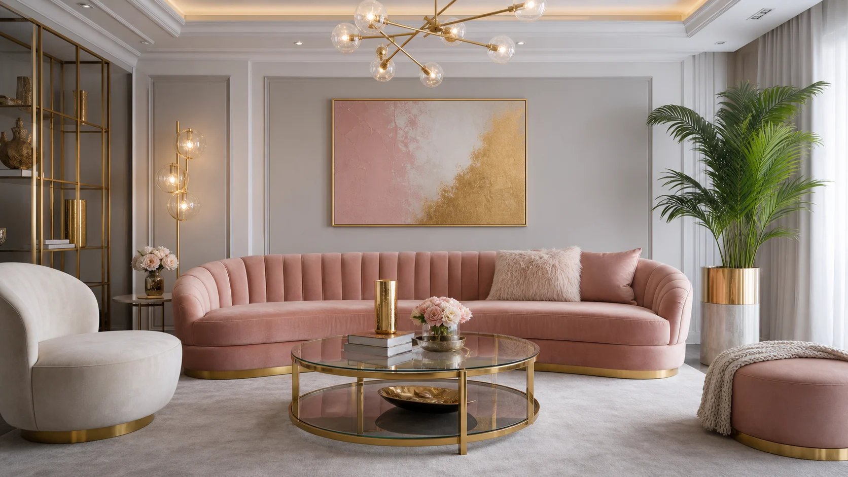
More contemporary, softly sculptural and restrained in its historical references.
Choose Hollywood Regency for stronger classic architecture, high contrast and deliberate theatricality.
Lacquer, palms and oversized imagery replace the calmer curve-led composition.
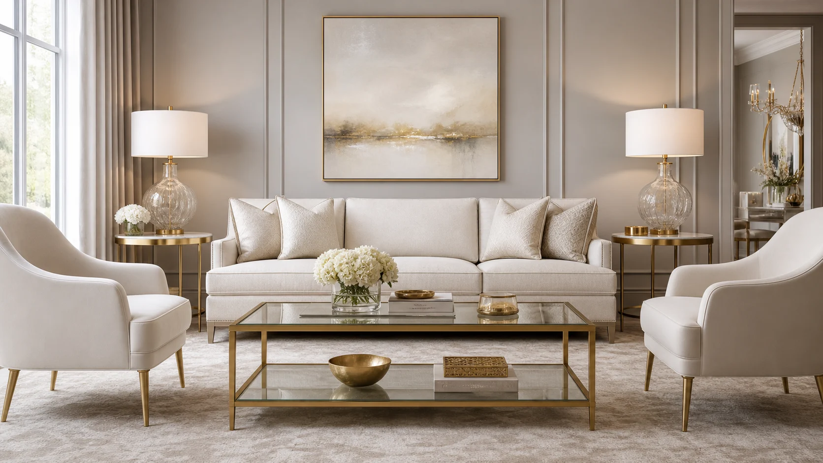
Quieter, more symmetrical and grounded in timeless neutral furniture.
Choose Hollywood Regency when the room should surprise rather than simply feel polished.
Jewel color and eclectic showpieces replace measured pairs and muted continuity.
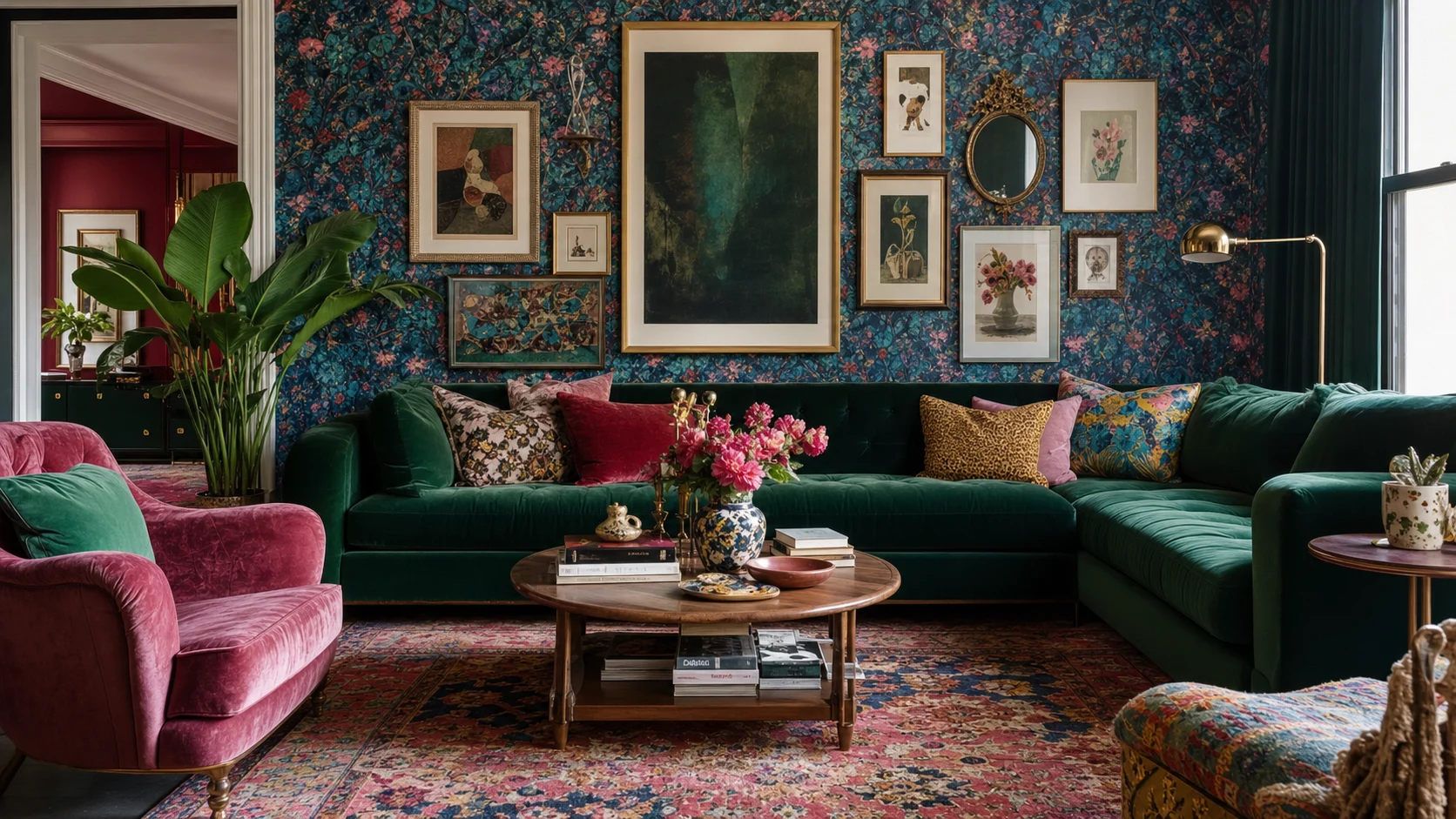
Denser and freer in pattern, color and collections, without requiring a controlled glamorous palette.
Choose Hollywood Regency for a more edited, high-contrast form of visual abundance.
A staged hierarchy replaces all-over layering and personal collections.
Look for objects that can command a view while still performing a useful role. Strong scale and silhouette matter more than a Hollywood label.
Choose one polished anchor with closed storage and enough wall space for a mirror or artwork above.
An opaque sculptural base and dark shade add drama without another mirrored surface.
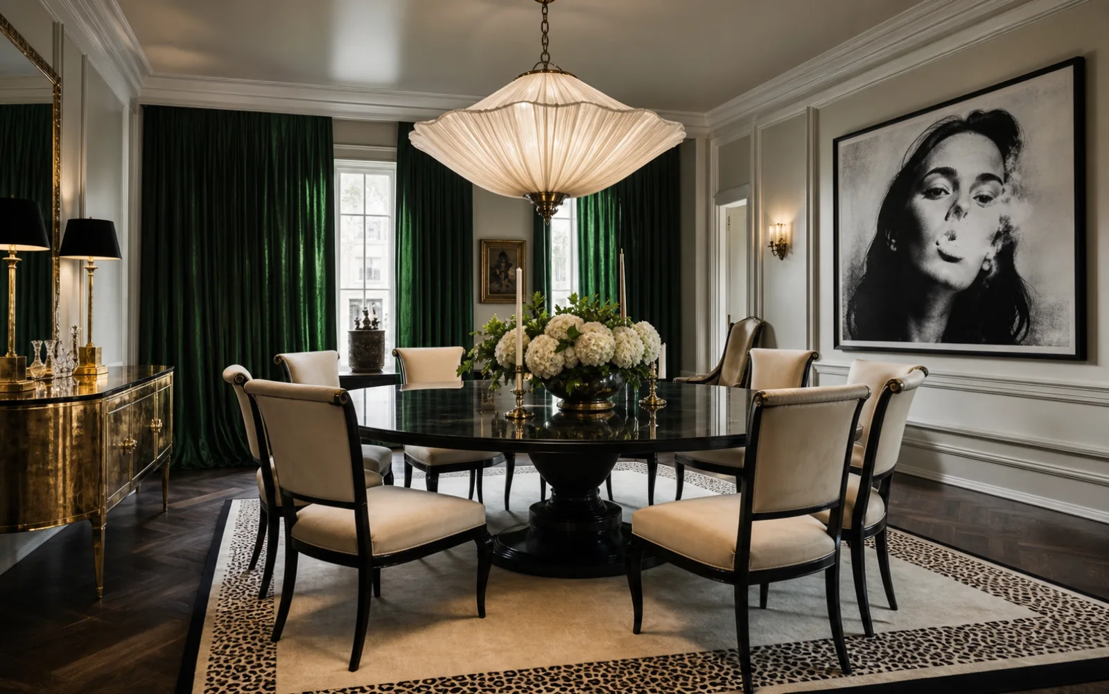
Use a generous diffused fixture to create atmosphere and lower its output with a dimmer.
Color and gloss make the focal statement; ergonomics and cable routing keep it viable for work.
Limit reflective backing to one display zone so the working kitchen remains calm.
Confirm the reflected view and balance it with two opaque lamps or sconces.