Apartment-scale sofa
Compare overall depth, usable seat, arm width, leg attachment, cushion recovery and the route from building entrance to room.
Keep the footprint lean, concentrate color in one tactile piece and let walnut, stone and opal glass supply the warmth.
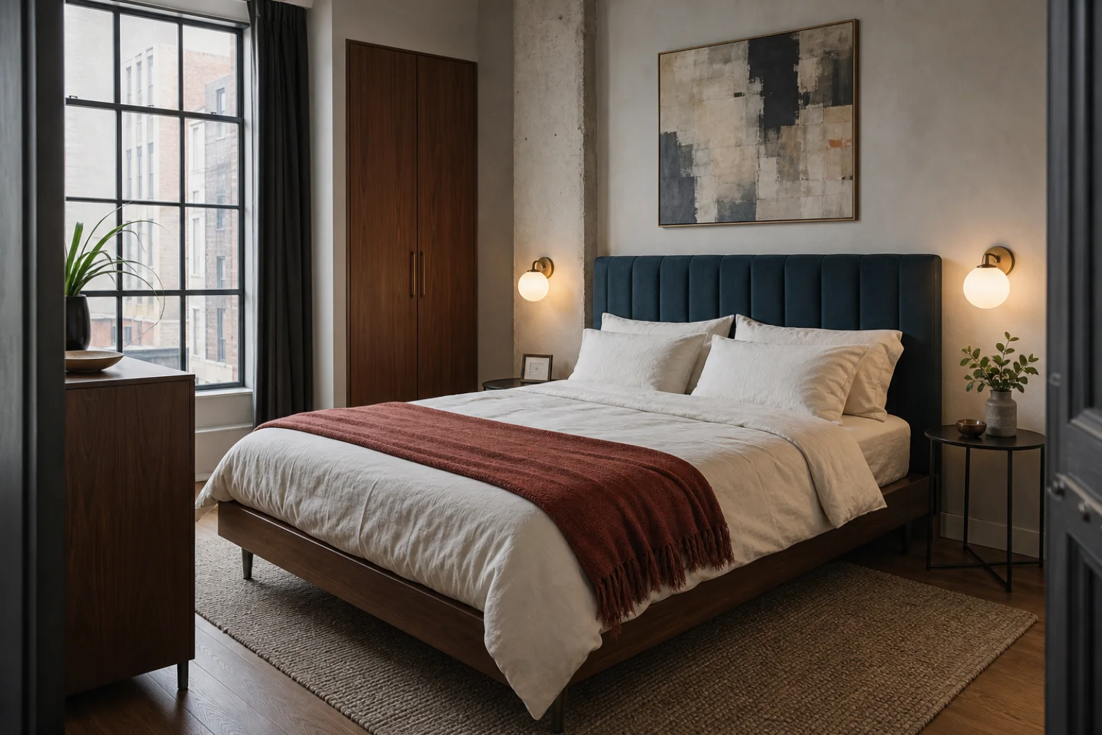
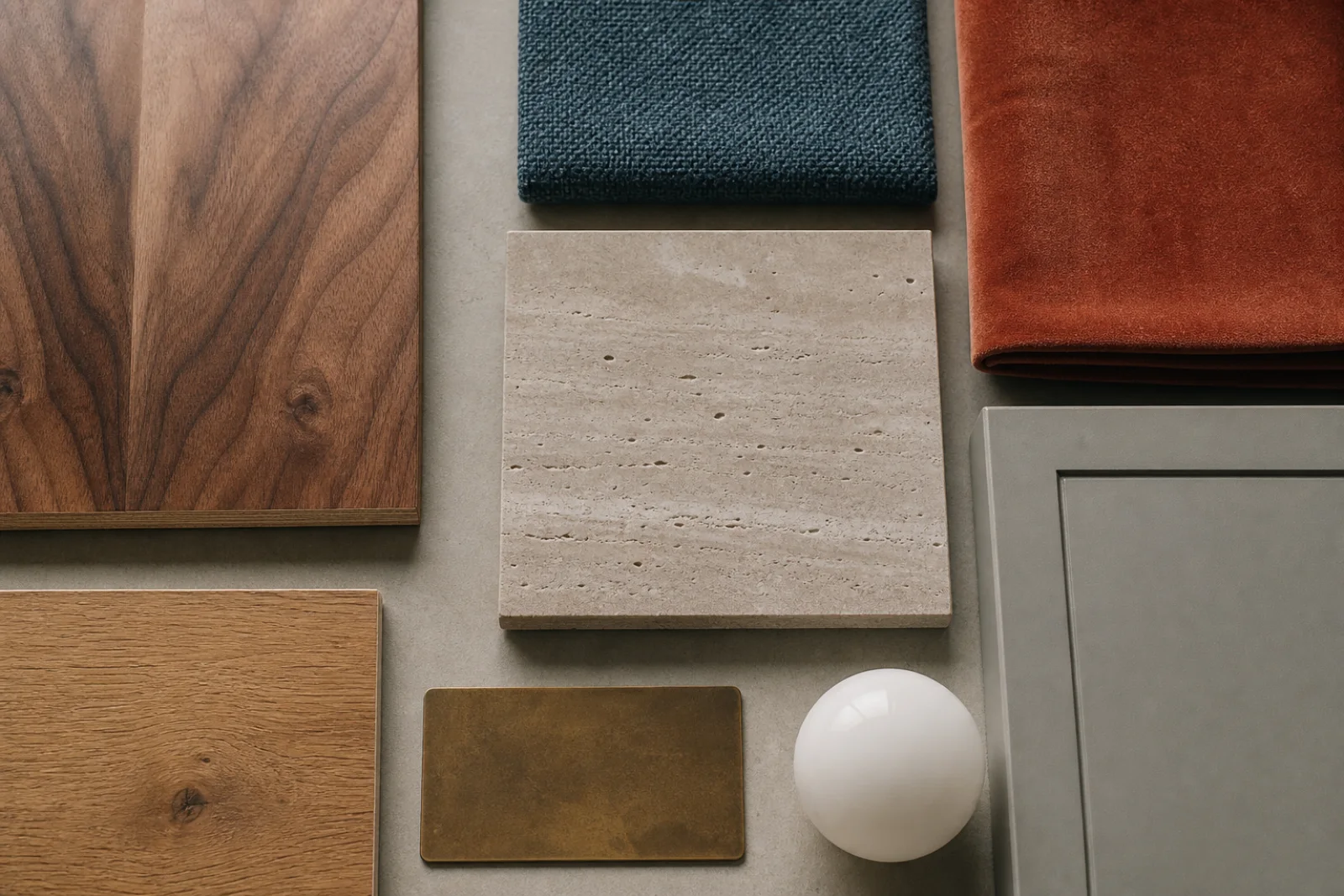
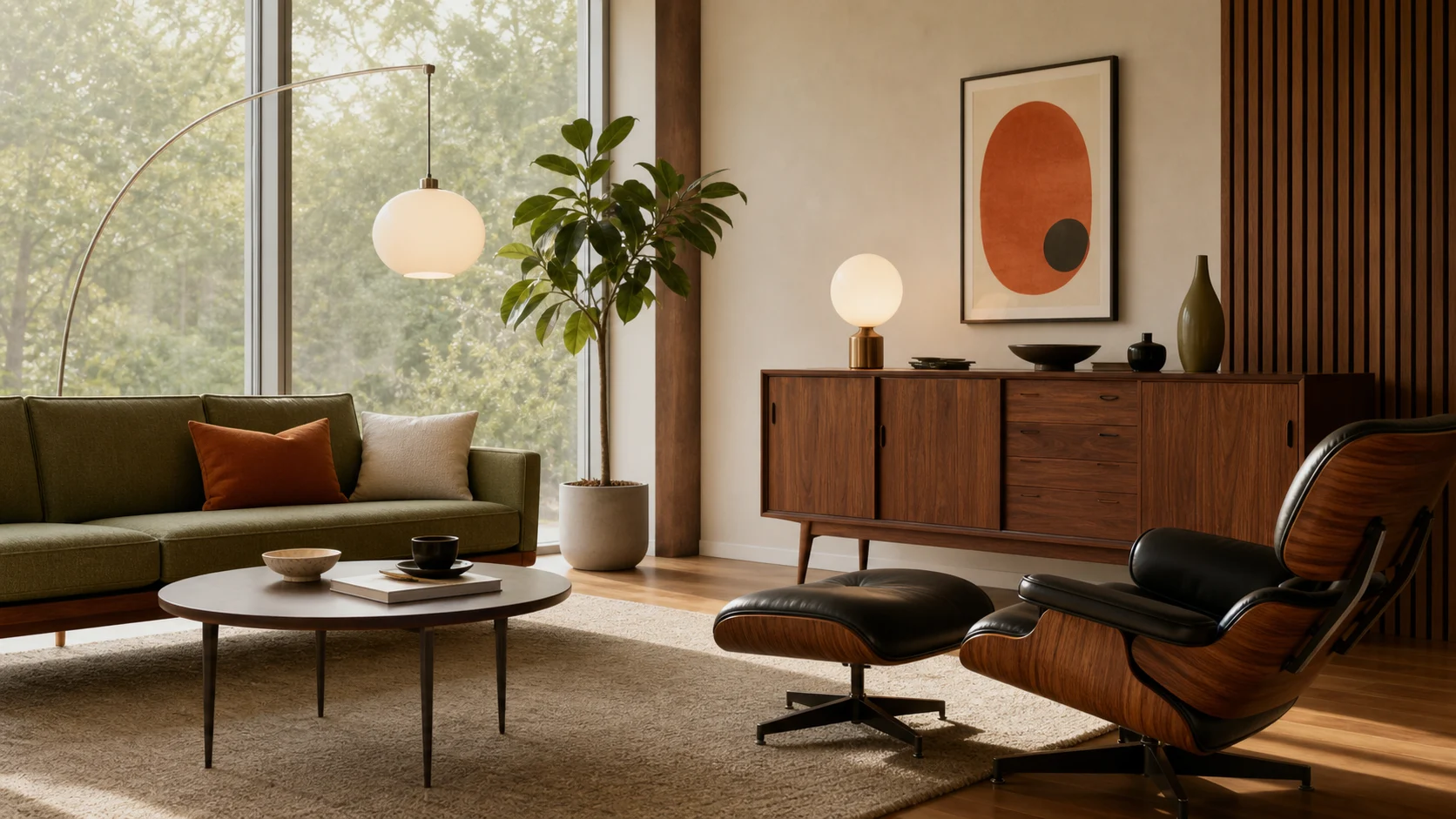
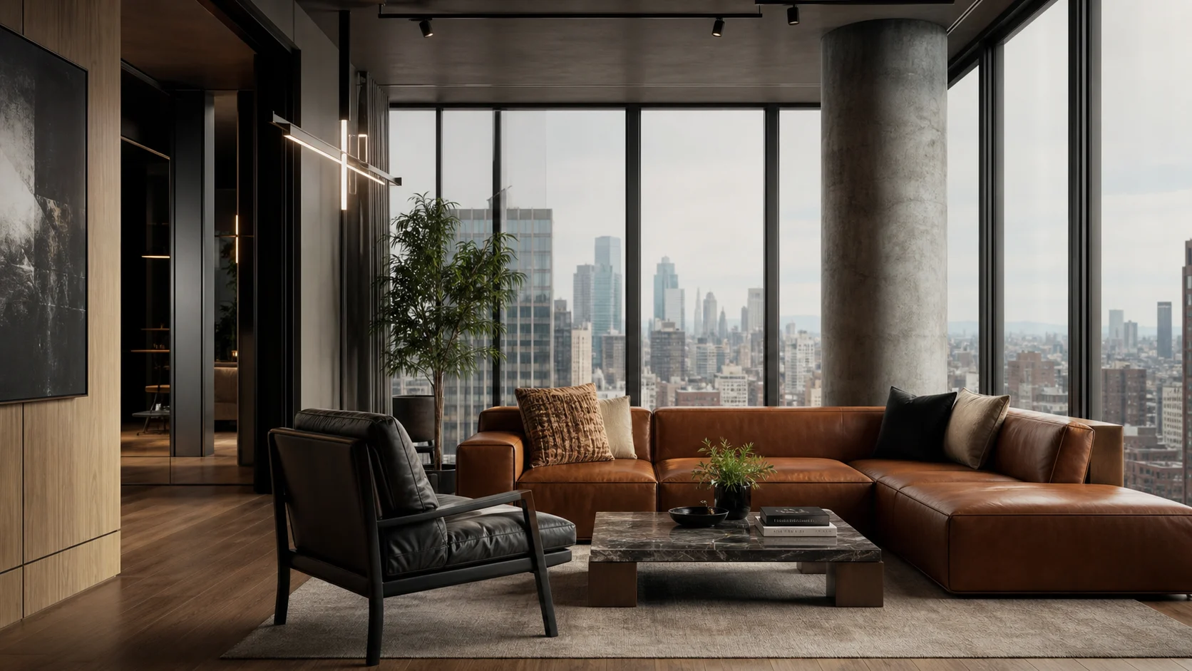
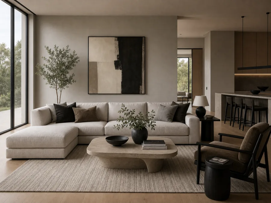
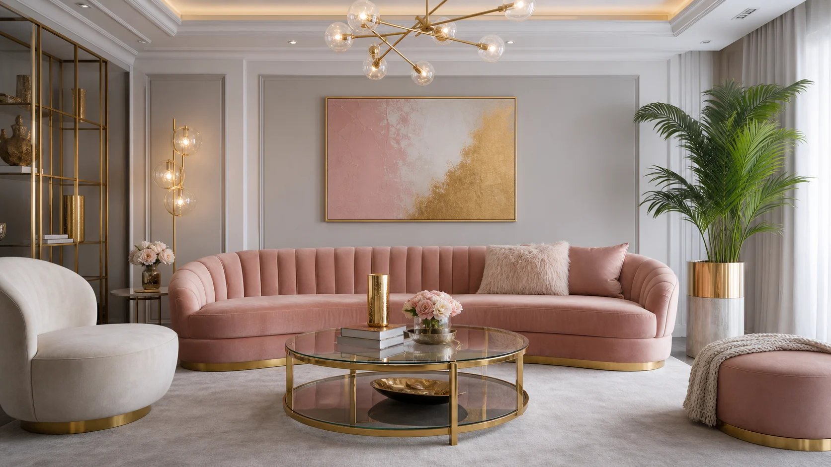
West Elm Modern-inspired design combines current urban practicality with a softened mid-century vocabulary: raised furniture, warm walnut, rounded geometry, saturated upholstery and sculptural light. It is less about reproducing a historical room than using visually light forms to make a city apartment feel composed and expressive. This independent guide is not affiliated with or endorsed by West Elm.
The successful version depends on editing. Pick one saturated textile, one dominant wood and one pale mineral surface, then repeat each with restraint. Check veneer direction and edge quality, upholstery wear, table clearances and the glare from exposed globes before buying. A few well-proportioned pieces leave more useful negative space than a collection of small “statement” objects.
Reserve a clear route through the apartment first, then fit seating, tables and storage into the remaining usable zones.
Aligned grain can look rich, but edge treatment, substrate, finish and repair options determine how the piece will age.
Let one chair, banquette or headboard carry the saturated tone; repeat it only in two much smaller moments.
Visible floor beneath sofas and cabinets reduces visual weight without sacrificing useful storage.
Deep teal or rust gives the room identity when it belongs to one major upholstered plane.
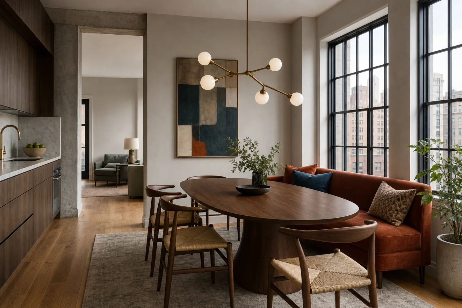
Oval tables and globe lights temper straight cabinetry, windows and architectural grids.
A lamp, tray or vessel should support light, storage or daily ritual instead of filling a styled shelf.
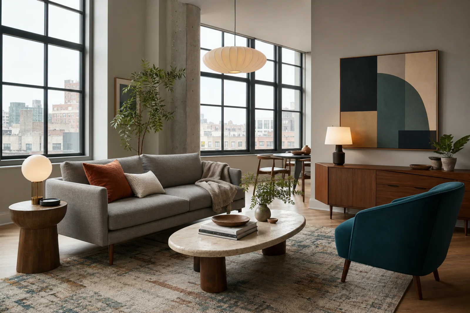
Choose a sofa shallow enough for the plan, keep the main path clear and use an oval table where sharp corners would pinch circulation.
Concentrate teal at the headboard, use slim bedside surfaces and confirm that wardrobe doors and drawers open without narrowing the route.
An oval pedestal improves corner clearance; test knee room, chair pullback and pendant height before adding a banquette.
A slender desk still needs adequate depth, monitor distance, cable control and an ergonomic chair that can move freely.
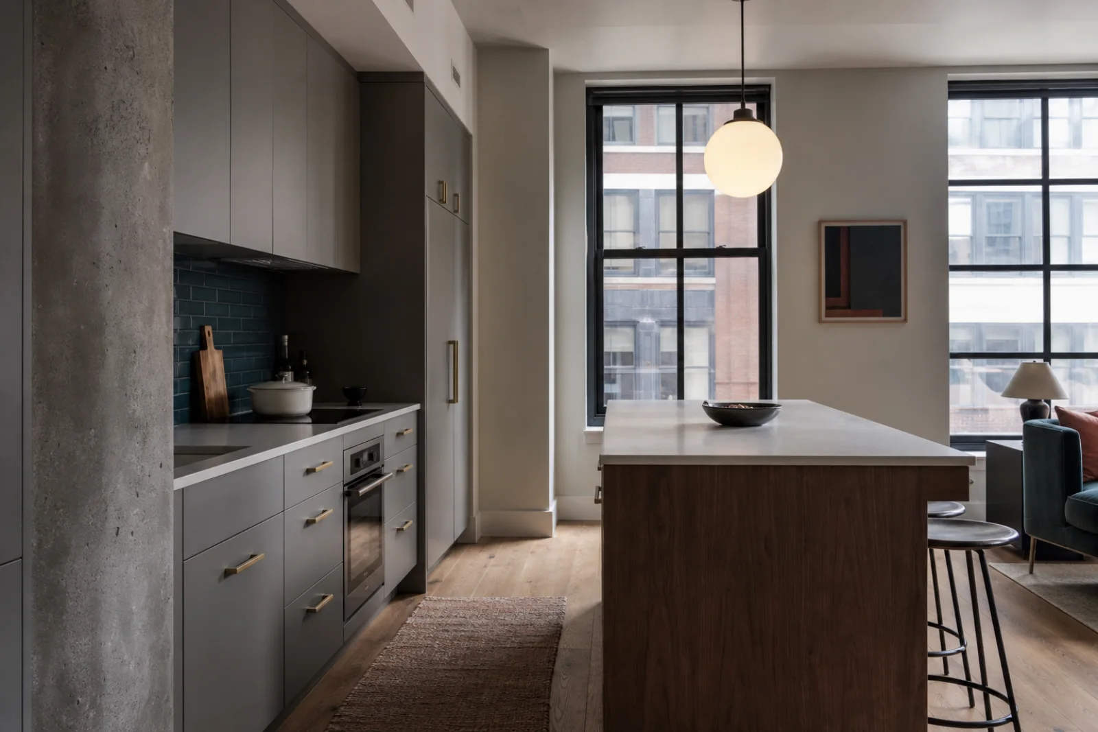
Limit walnut to the island or upper fronts, use a wipeable backsplash and keep brass away from places where a fragile finish will be scrubbed daily.
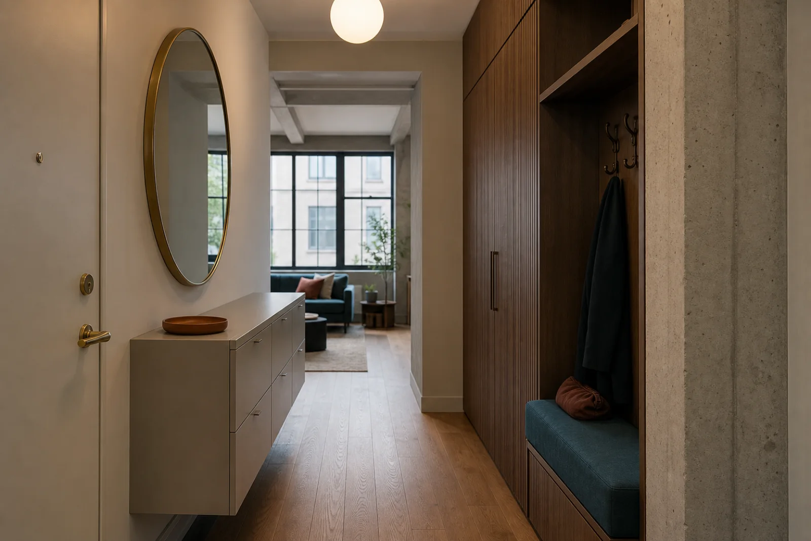
Use concealed shallow storage, one upholstered perch and a mirror that expands light without projecting into the walking line.
Use warm grey and bone for the largest areas, walnut for one continuous storage or table element and deep teal on one upholstered plane. Muted rust should be smaller than teal, while aged brass works best as a thin line rather than a room-wide finish.
A city-neutral field for walls and cabinetry that accepts both walnut and saturated color.
The main warm material, strongest when grain direction is deliberate and repeated sparingly.
A cool anchor for one chair, headboard or work seat rather than every accessory.
A small warm counterpoint that prevents teal and grey from feeling corporate.
A pale textile and stone bridge that keeps high contrast comfortable.
A low-sheen metal accent for selected light fittings and handles.
Review grain sequence, substrate, edge banding and finish under side light; a dramatic face cannot compensate for weak construction.
Compare abrasion, pile marking, cleaning and daylight fade before assigning saturated fabric to a high-use seat.
Ask how voids are filled, test stains and review edge profiles; stone still needs a realistic lifting and maintenance plan.
Diffuse the lamp source, confirm dimming and keep warm metal to a few coordinated touchpoints.
Treat the apartment as a sequence of clear zones, not a display floor. Solve movement, storage and lighting first, then use one color-rich surface to give each zone identity.
Draw the main route and keep corners near doors, windows and kitchen stools free before sizing furniture.
Choose walnut for the visual anchor, then use quieter oak or painted finishes where another wood note would compete.
Place teal or rust on the largest suitable textile and echo it only at a much smaller scale.
Combine diffused overhead, task and low lamp light; dim globes that would otherwise reflect in windows or screens.
When the room feels wrong, change the underlying decision before adding more decor.
Keep one sculptural light and one color-rich seat; remove objects that do not support a function.
Break it with warm-grey cabinetry, pale stone and visible wall so grain remains a focal material.
Reduce it to thin hardware and lamp details, using black or quiet painted metal elsewhere.
Use the lifted proportions and warm wood, but avoid reproducing a complete period furniture set.
West Elm Modern-inspired rooms borrow mid-century proportions but are not period interiors. Their distinct character comes from compact urban planning, controlled saturated color and a polished mix of walnut, pale mineral surfaces and diffused light.
Historically grounded, with recognizable twentieth-century furniture types, architectural ideas and period material logic.
Choose West Elm Modern for a looser contemporary interpretation suited to current apartment plans and mixed price points.
Current urban editing replaces period fidelity.
Rougher and more architectural, often emphasizing concrete, steel, brick and oversized contemporary art.
Choose West Elm Modern for warmer walnut, softer upholstery and clearer mid-century influence.
Polished warmth replaces industrial edge.
Tracks broader current design and can be more neutral, sculptural or luxurious without a fixed wood-and-color vocabulary.
Choose West Elm Modern when walnut, raised silhouettes and saturated textiles should organize the room.
A defined retail-modern vocabulary replaces general newness.
More reflective and decorative, using polished metal, velvet, glass and stronger luxury signals.
Choose West Elm Modern for matte stone, restrained brass and everyday apartment practicality.
Tactile restraint replaces shine.
Buy by proportion and finish integrity rather than silhouette alone. Check delivery access, veneer edges, seat dimensions, textile performance and lighting glare before committing to the room’s visual anchors.
Compare overall depth, usable seat, arm width, leg attachment, cushion recovery and the route from building entrance to room.
Inspect grain alignment, ventilation for equipment, cable exits, door clearance and the finish on every visible edge.
Test back angle and seat support, then verify abrasion, pile behavior and how the color changes in daylight.
Check the pedestal footprint, edge comfort and full chair clearance in the actual dining zone.
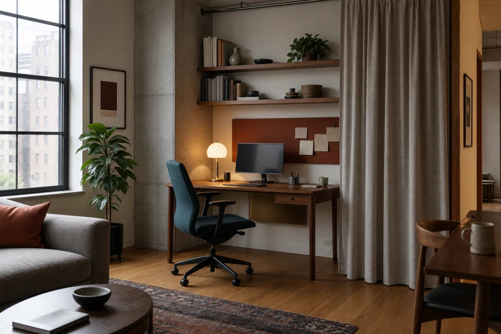
Confirm bulb access, dimmer compatibility, glare control and safe clearance above work and dining surfaces.
Review walnut, teal wool, rust velvet, travertine, oak, brass, glass and cabinet finish together at day and night.