Antique walnut commode
Look for useful storage, balanced proportions and a surface whose age does not depend on heavy distressing.
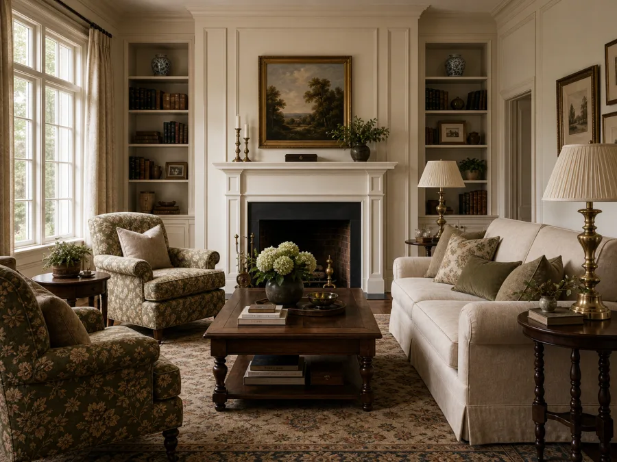
European rooms shaped by proportion, provenance and patina—formal enough to feel composed, relaxed enough to remain a home.
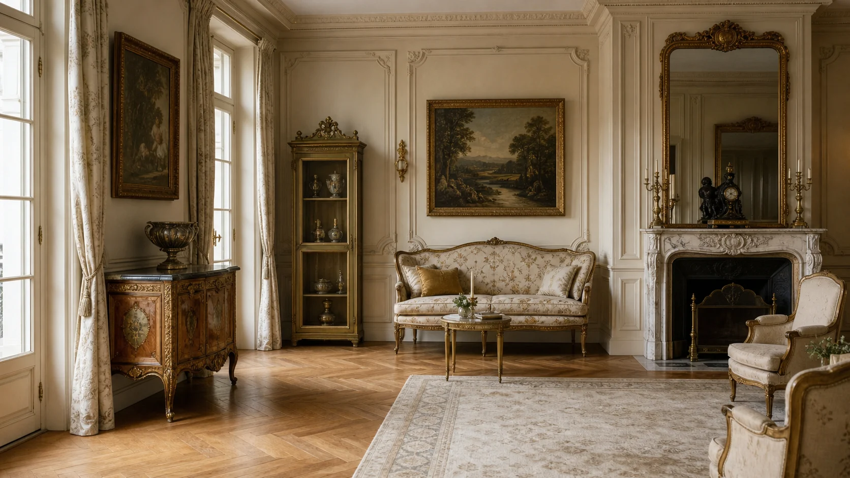
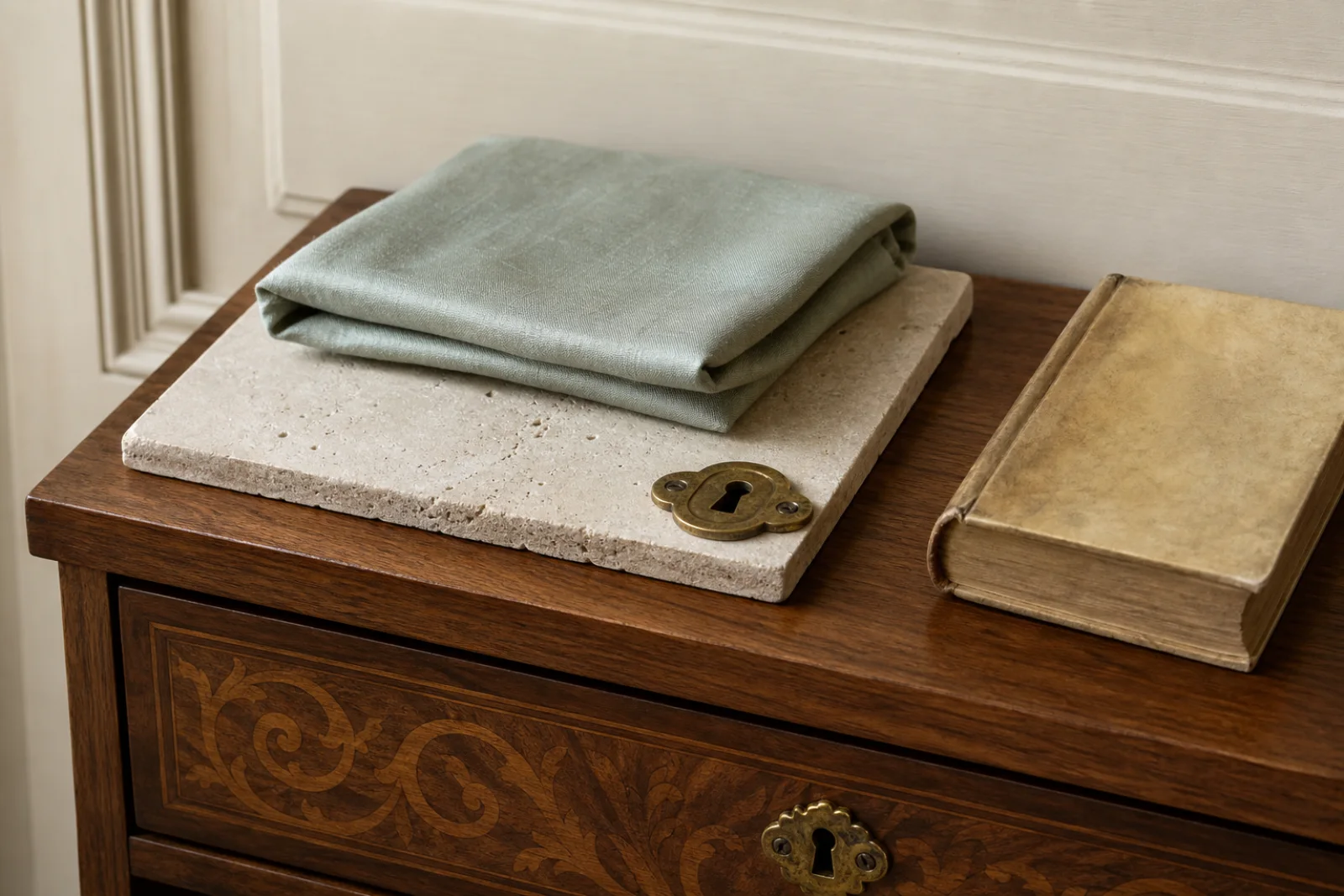
European Classic design draws from the shared domestic language of French apartments, English townhouses and Italian palazzi: paneled walls, ordered openings, natural stone, parquet floors and furniture with visible lineage. It is not one strict period. The coherence comes from proportion and material quality rather than from copying a historical room intact.
The most convincing spaces establish a calm architectural frame, then place a few darker, older objects within it. Patina is welcome, but wear should feel genuine rather than manufactured. Ornament has a job—marking an opening, framing a wall or completing a cornice—so the room remains legible even when individual pieces are decorative.
Align doors, panels, lighting and major furniture before considering decorative objects.
French, English and Italian pieces can coexist when scale, wood tone and craftsmanship relate.
A softened stone edge or mellow walnut surface gives the room credibility that new distressed finishes cannot.
Cornices, paneling and centered openings establish order before furniture enters the room.
Walnut and mahogany silhouettes gain presence against parchment, stone and muted grey walls.
Carving, gilt and molding concentrate around thresholds, mirrors and focal pieces instead of covering every surface.
Stone, timber, leather and metal are allowed to mellow, connecting objects of different origins.
Build the composition around the fireplace or main window, then balance—not mirror—the furniture on either side.
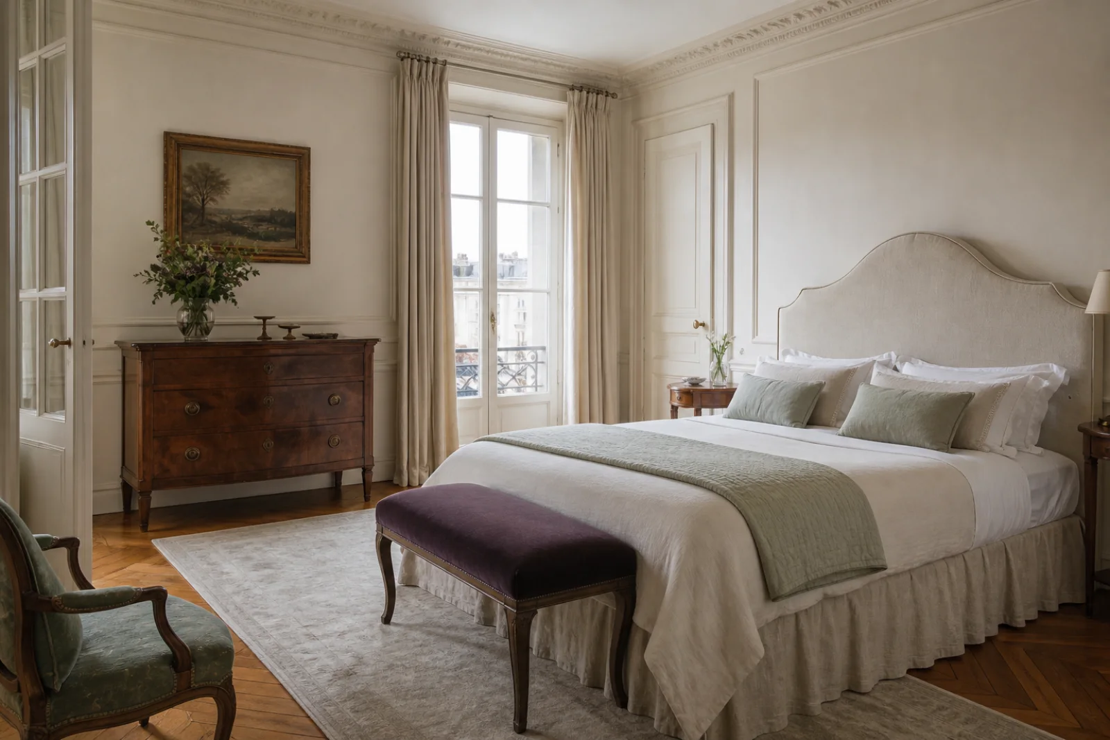
Use a shaped upholstered headboard, one dark commode and plain linen; the architecture should carry most of the formality.
Choose a table with real visual weight and keep the chandelier centered on it, even when the room itself is imperfect.
Paint fitted shelves a muted olive and pair them with a genuinely useful antique desk rather than decorative library props.
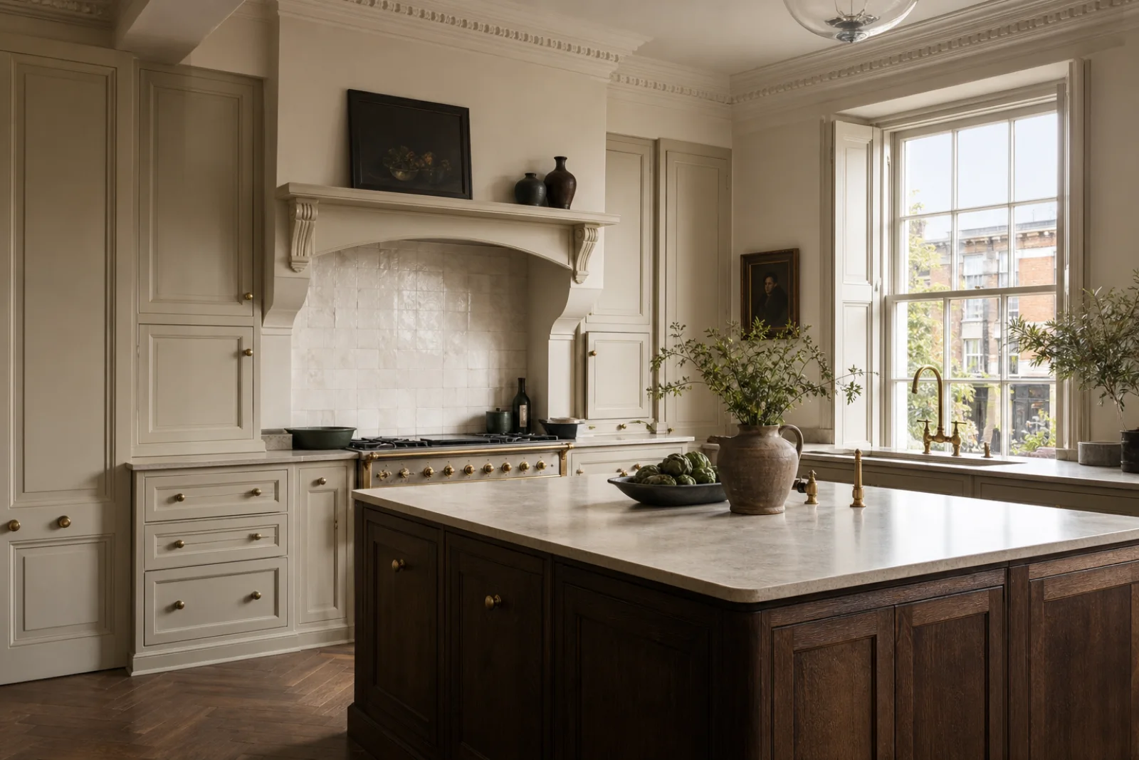
Treat cabinetry as millwork: consistent stiles, a modest cornice and honed stone are more persuasive than applied ornament.
Use floor pattern and aligned openings to create arrival; one console and mirror are enough furnishing.
Let parchment and stone occupy most of the room, use walnut as the structural dark and reserve celadon or oxblood for one textile story. The palette should appear mellowed, never uniformly beige.
A warm architectural neutral that holds paneling and plaster relief without looking yellow.
A faded green for textiles, cabinetry or one painted room.
The dark anchor that gives pale rooms gravity and historical depth.
Connects limestone, aged silver and cool daylight.
A controlled accent for dining upholstery, a book spine or a narrow border.
Fine grain and restrained inlay make one case piece a focal point without requiring a matching suite.
A low-sheen surface brings architectural permanence to floors, mantels and worktops.
Its slight irregularity keeps tailored curtains and upholstery from feeling ceremonial.
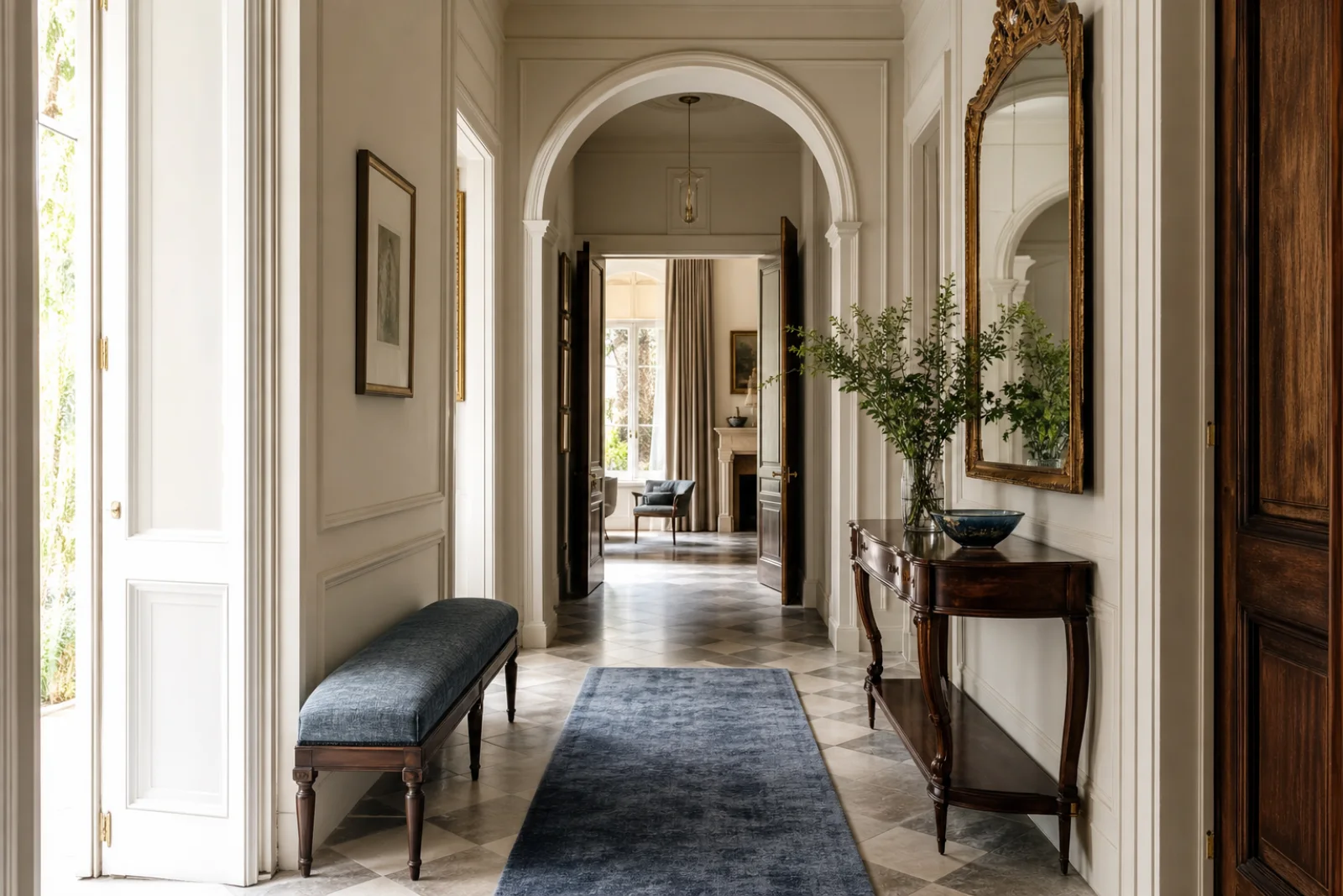
Small fittings add warmth; a consistent unlacquered finish matters more than quantity.
Work from the room outward. European Classic succeeds when architecture, furniture and objects form a clear hierarchy rather than competing to look expensive.
Identify the strongest window, fireplace or opening and align the main furniture group with it.
Use one pale wall color and repeat a restrained molding profile at the correct scale.
Place one or two walnut, mahogany or aged leather pieces where their silhouettes remain clear.
Introduce art, books, textiles and metalwork slowly; keep only objects that add provenance or use.
When the room feels wrong, change the underlying decision before adding more decor.
Concentrate detail at one focal wall and simplify surrounding textiles, lighting and casework.
Mix origins and dates, allow practical contemporary comfort and avoid complete matching furniture suites.
Add a dark timber anchor, stone grey and one faded chromatic note such as celadon or oxblood.
Choose honest natural materials and let them age; use true vintage pieces where patina is important.
European Classic is not shorthand for any room with molding and antiques. Its distinction lies in architectural order, credible materials and a cross-European mix that has settled over time.
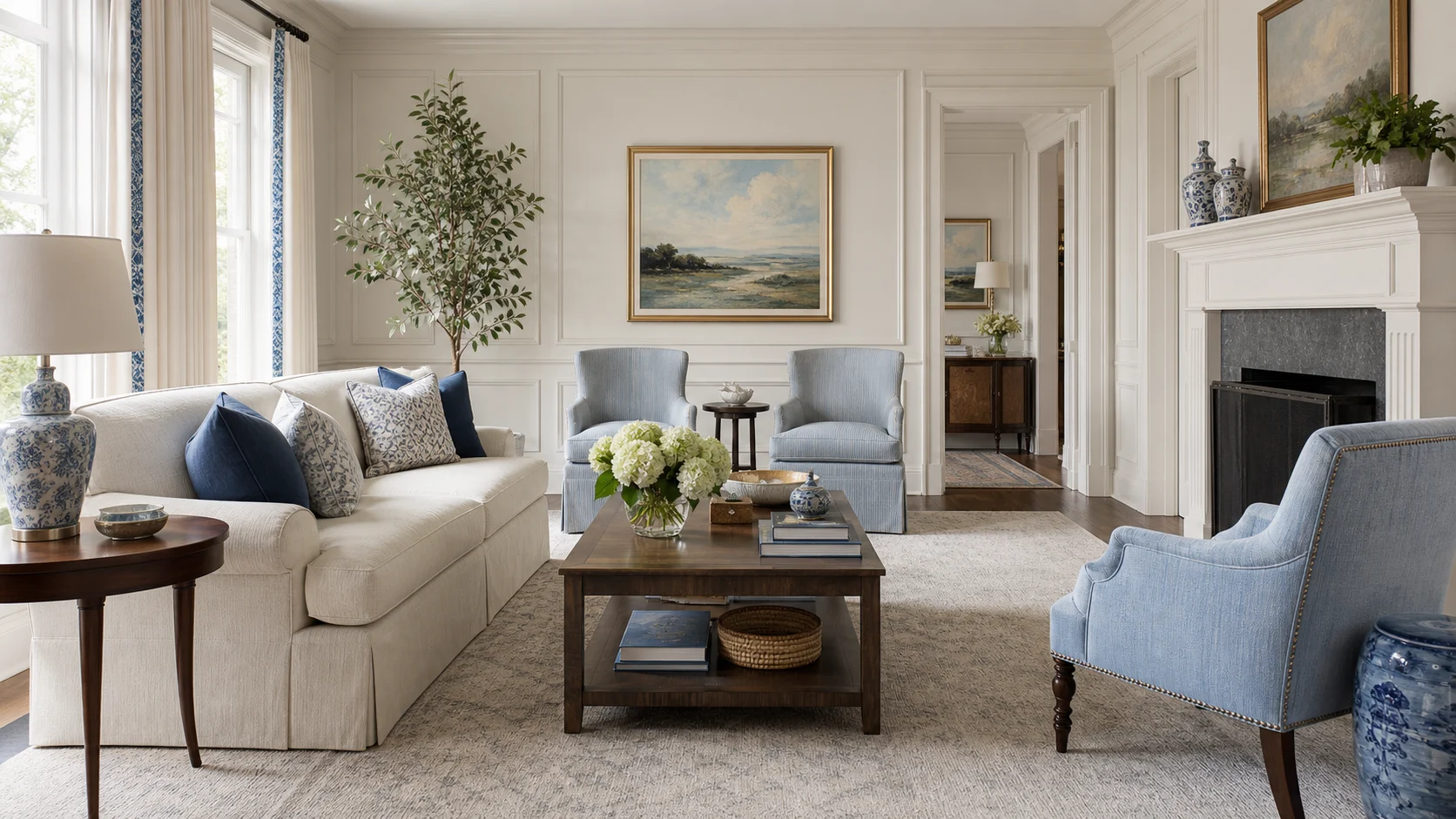
Broader and often more tied to one national or period vocabulary, especially English and American precedents.
Choose European Classic for a cross-continental architectural mix and stronger emphasis on provenance.
Pale formal architecture supports French, English and Italian pieces together.
Brighter, more conversational and more willing to use graphic pattern, contemporary art and sharp color.
Choose European Classic when age, restraint and architectural continuity matter more than contrast.
Patina and proportion replace the deliberate old-new juxtaposition.
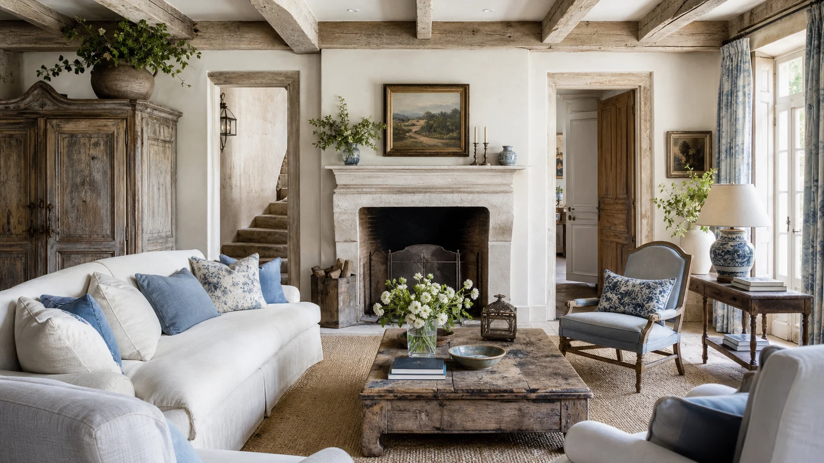
Softer, more provincial and rustic, with washed finishes, casual linen and rural references.
Choose European Classic for urban formality, polished timber and a more ordered room plan.
Paneling, parquet and fine case pieces replace weathered farmhouse texture.
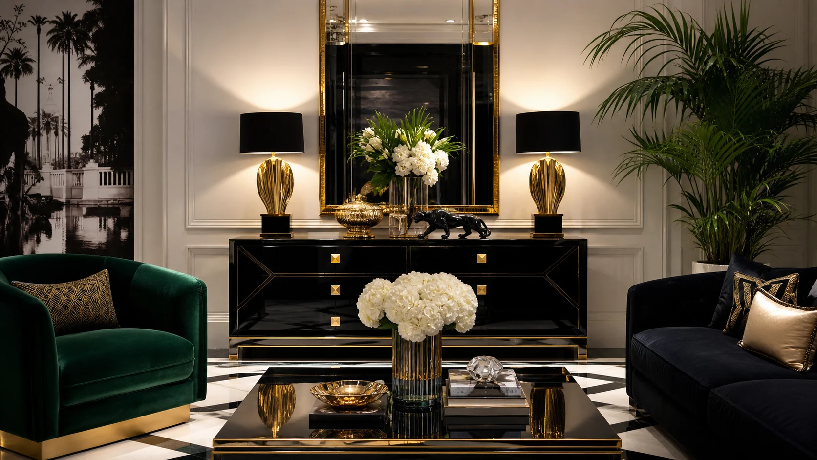
More theatrical, glossy and symmetrical, with lacquer, mirror and high-contrast glamour.
Choose European Classic for quiet material authority and furniture that looks accumulated rather than staged.
Honed stone and mellow wood replace reflective glamour.
Buy fewer pieces and inspect construction. One correctly scaled antique, a good wool rug and full curtains will contribute more than a room of reproduction accessories.
Look for useful storage, balanced proportions and a surface whose age does not depend on heavy distressing.
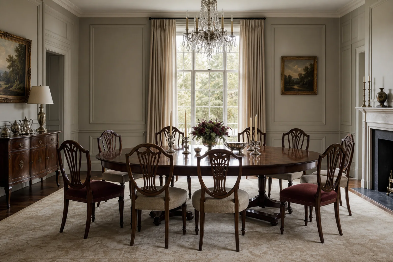
A strong perimeter and extending mechanism make formal dining adaptable to everyday use.
Hang them high and full, using simple headings so fabric softens the architecture without hiding it.
Accept subtle etching and variation; a low sheen is integral to the room’s mature character.
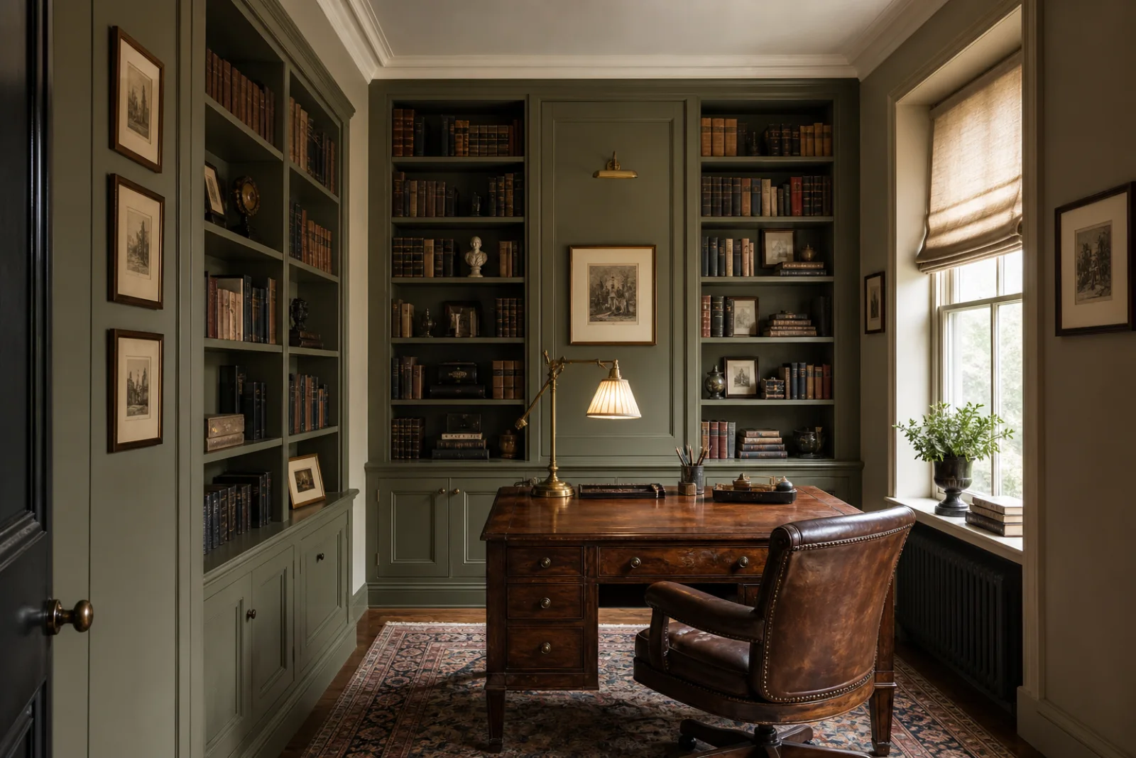
A focused brass light gives an antique desk contemporary usefulness without changing its visual language.
Use gilt once, where it can mark arrival or reflect daylight rather than act as a room-wide finish.