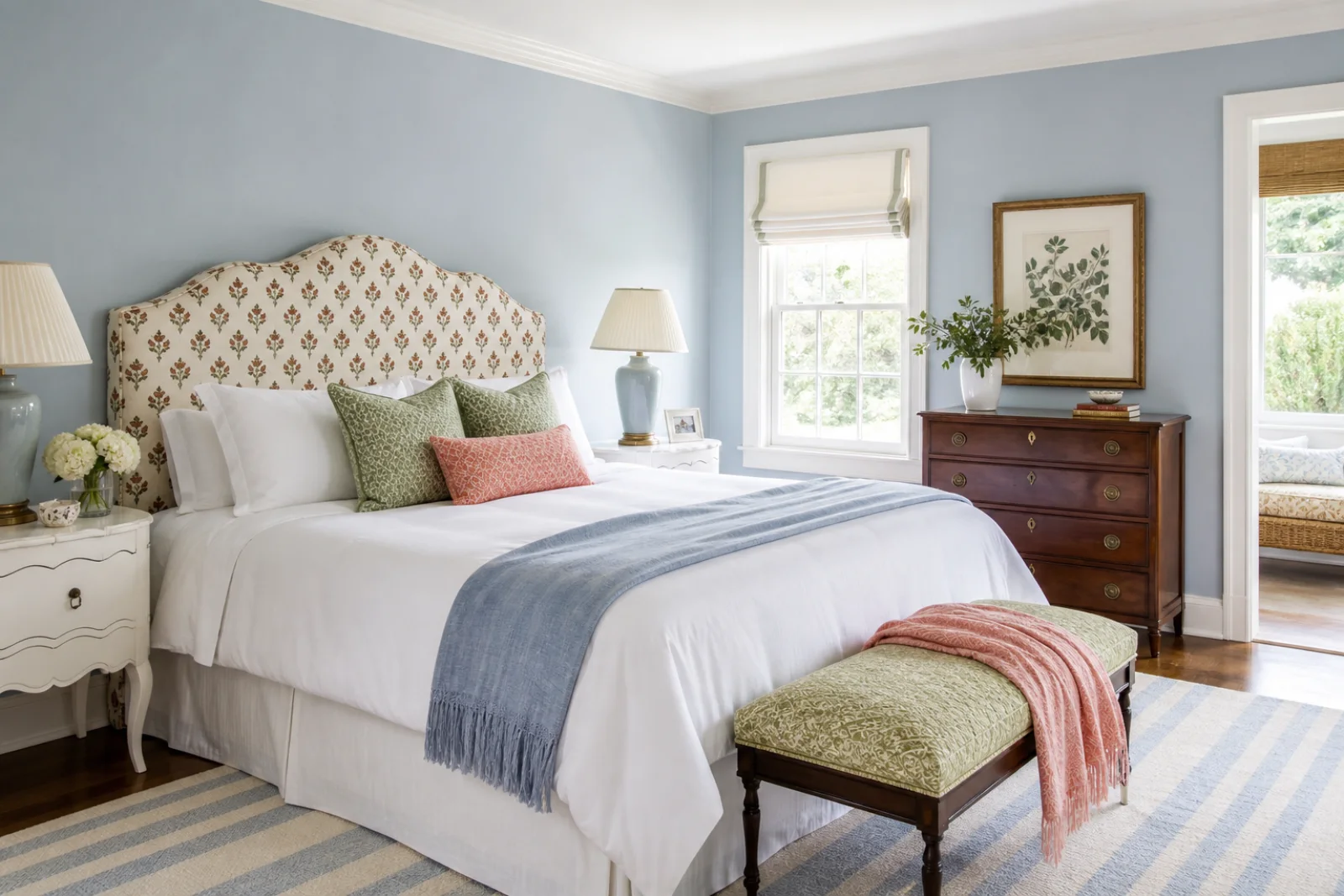
Block-print headboard
Choose a compact repeat and tailored outline so pattern reads clearly from across the room.
Familiar pattern, inherited character and tailored detail—edited with enough contrast and breathing room to feel current.
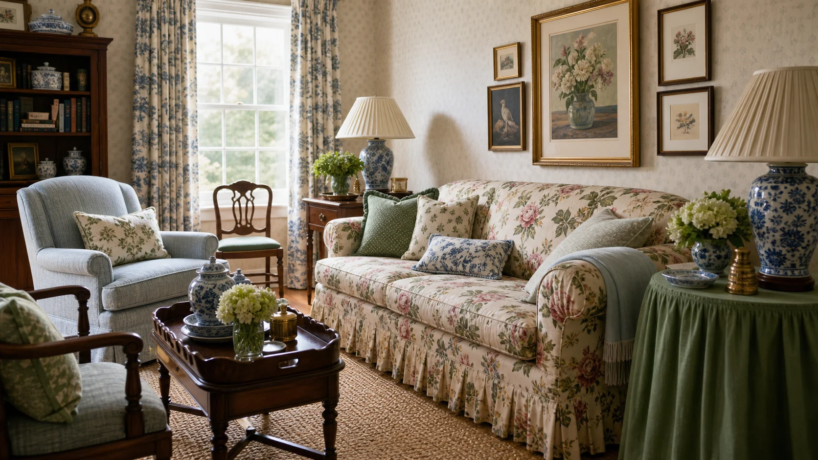
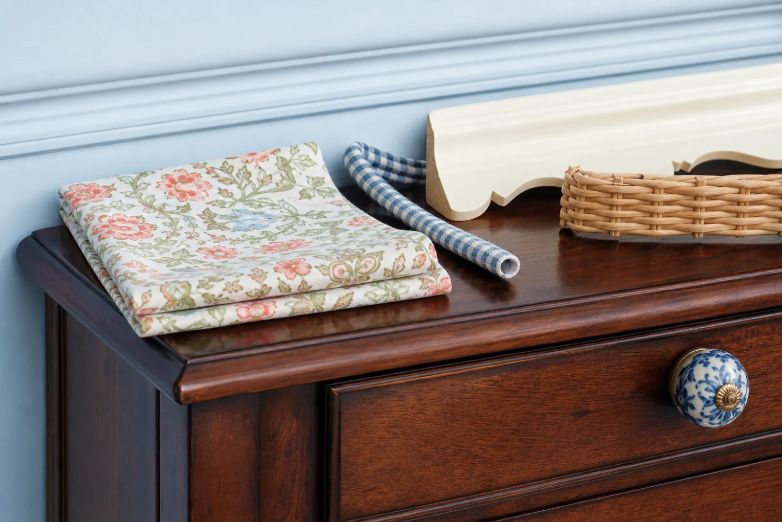
Grandmillennial design is a contemporary return to decorating details once associated with grandparents’ homes: chintz, gingham, pleated shades, wicker, embroidery, scalloped edges and dark wood furniture. Its point is not to recreate a period room. Familiar elements are selected with affection, then sharpened through brighter color, cleaner silhouettes and an obvious mix of old and new.
The best rooms organize nostalgia rather than accumulating it. One lead print sets the palette, a stripe or check supplies contrast and plain upholstery gives the eye somewhere to rest. An antique chest may sit beside lacquered furniture or a contemporary paper lantern. This deliberate generational tension distinguishes Grandmillennial from Victorian layering and from the rural fantasy of Cottagecore.
Start with one floral, block print or geometric paper and pull only two supporting colors from it.
Pair traditional fabric with a crisp headboard, clean bench or oversized contemporary light.
Give an inherited chest, desk or chair a real storage, work or seating role rather than treating it as a prop.
Chintz, gingham and block prints appear at different scales with clear areas of visual rest.
Piping, scallops, pleats and gathered panels finish specific objects instead of covering the whole room.
Antiques gain energy beside lacquered bamboo forms, paper lanterns and contemporary ergonomic seating.
Wicker, ceramics, needlework and framed botanicals feel personal when grouped with restraint.
Let one chintz sofa lead, then use plain chairs, a woven rug and blue-and-white ceramics in one concentrated group.
Use a small block print on the headboard, solid bedding and one antique chest; keep lamps paired and tailored.
Combine a dark inherited table with soft-green lacquered bamboo chairs and one oversized paper lantern.
Give gingham to pinboard and cabinet panels while keeping the desktop clear and the working chair genuinely ergonomic.
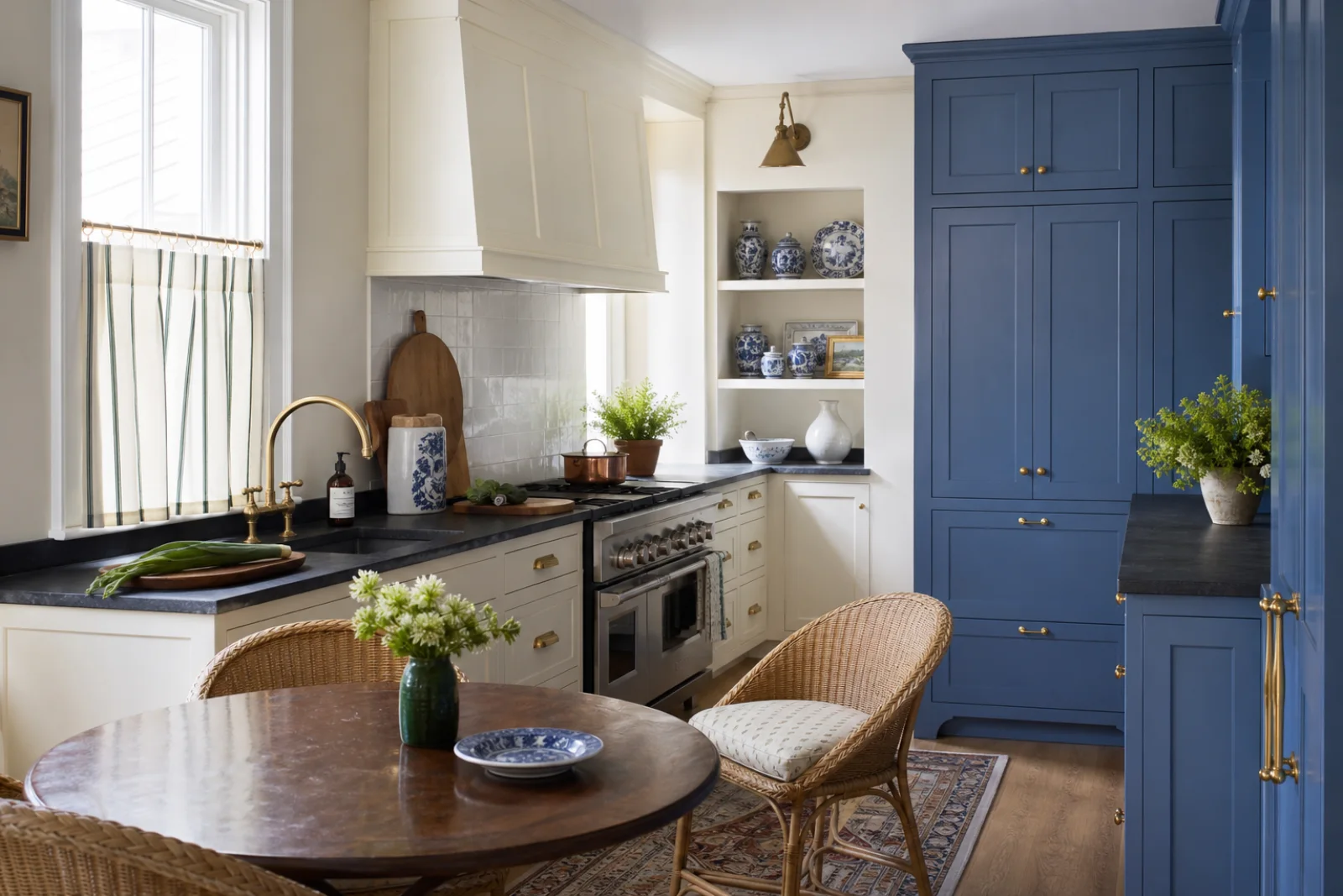
Use one saturated pantry, restrained ceramics and a striped café curtain rather than floral motifs on fixed cabinetry.
Limit pattern to the wall above a chair rail and ground it with an antique chest plus one coral-striped bench.
Pull two colors from the lead print, then add cream and natural dark wood. Repeat each accent at least twice, but vary its material and scale rather than matching objects exactly.
A fresh wall field that cools mahogany and supports blue-and-white ceramics.
A lively trim, stripe or cushion color used in short, confident notes.
Connects botanical prints, wicker and lacquered furniture without becoming sage-on-sage.
Gives checks, wallpaper and ceramics a consistent graphic anchor.
Provides quiet space around patterned textiles and dark furniture.
A compact repeat adds nostalgia without swallowing the silhouette of a headboard or chair.
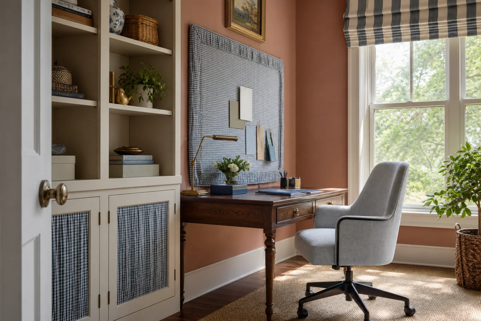
A graphic check works best as a boundary, panel or small counterpoint to a floral.
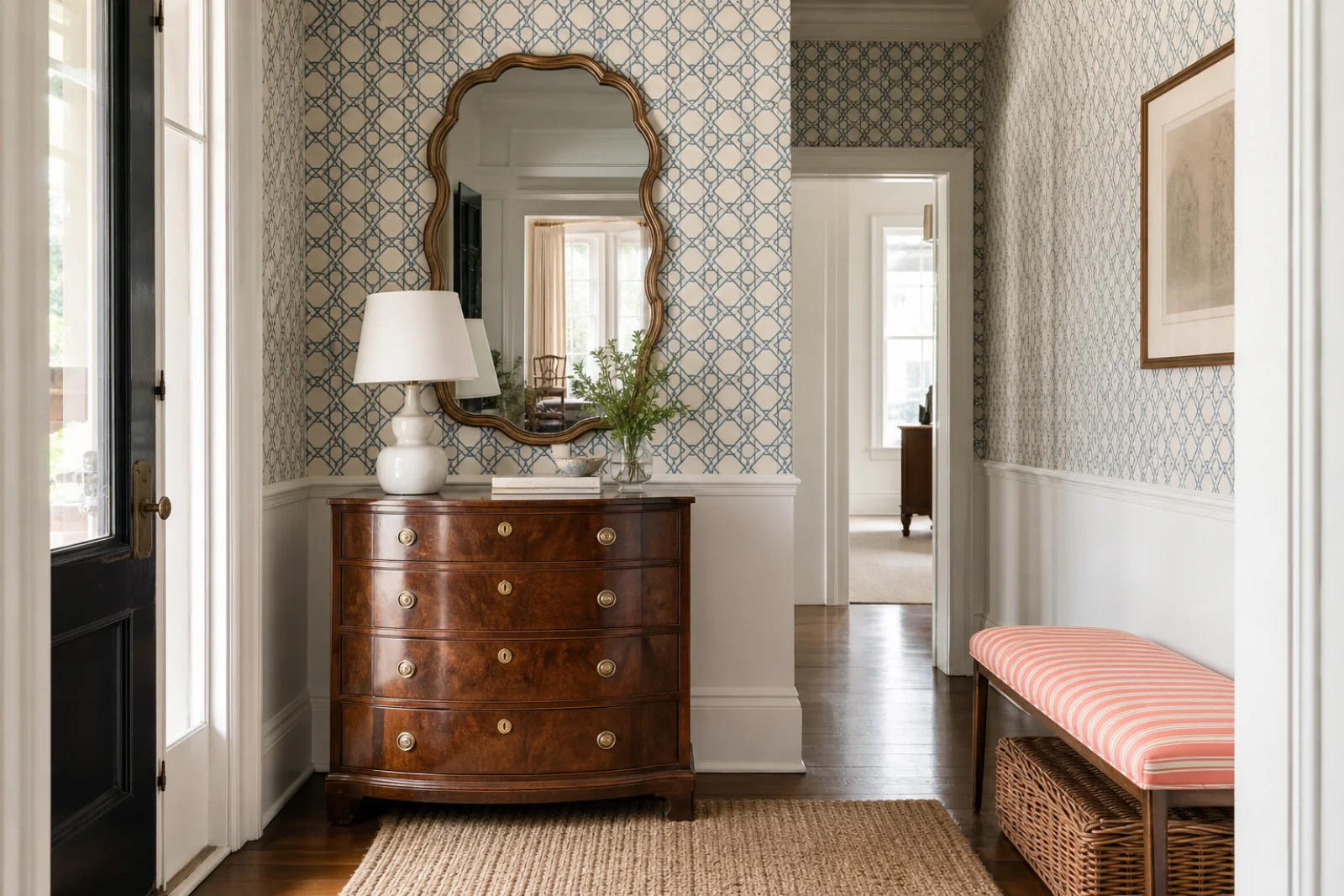
One dark case piece gives light pattern and lacquer necessary visual weight.
Its open weave brings casual texture to dining, storage and occasional furniture.
Begin with something personally meaningful, then build a controlled pattern hierarchy around it. The room should feel collected across generations, but edited in the present.
Choose one antique, inherited object or familiar pattern that deserves to lead the room.
Use one lead print, one smaller check or stripe and a majority of plain surfaces.
Introduce a crisp light, lacquered chair or modern working piece to prevent period imitation.
Group ceramics, books and framed pieces, then remove duplicates and preserve clear daily surfaces.
When the room feels wrong, change the underlying decision before adding more decor.
Keep one lead floral, introduce a check or stripe and return the largest upholstery plane to solid color.
Add one unmistakably contemporary object and sharpen the palette with coral, cobalt or lacquered green.
Concentrate ceramics and framed pieces in one display zone instead of scattering them across every table.
Assign one edge treatment per object and keep adjacent furniture clean-lined.
Grandmillennial is not simply traditional decor made younger. Its identity comes from knowingly selecting nostalgic motifs and placing them in a brighter, sharper and visibly contemporary composition.
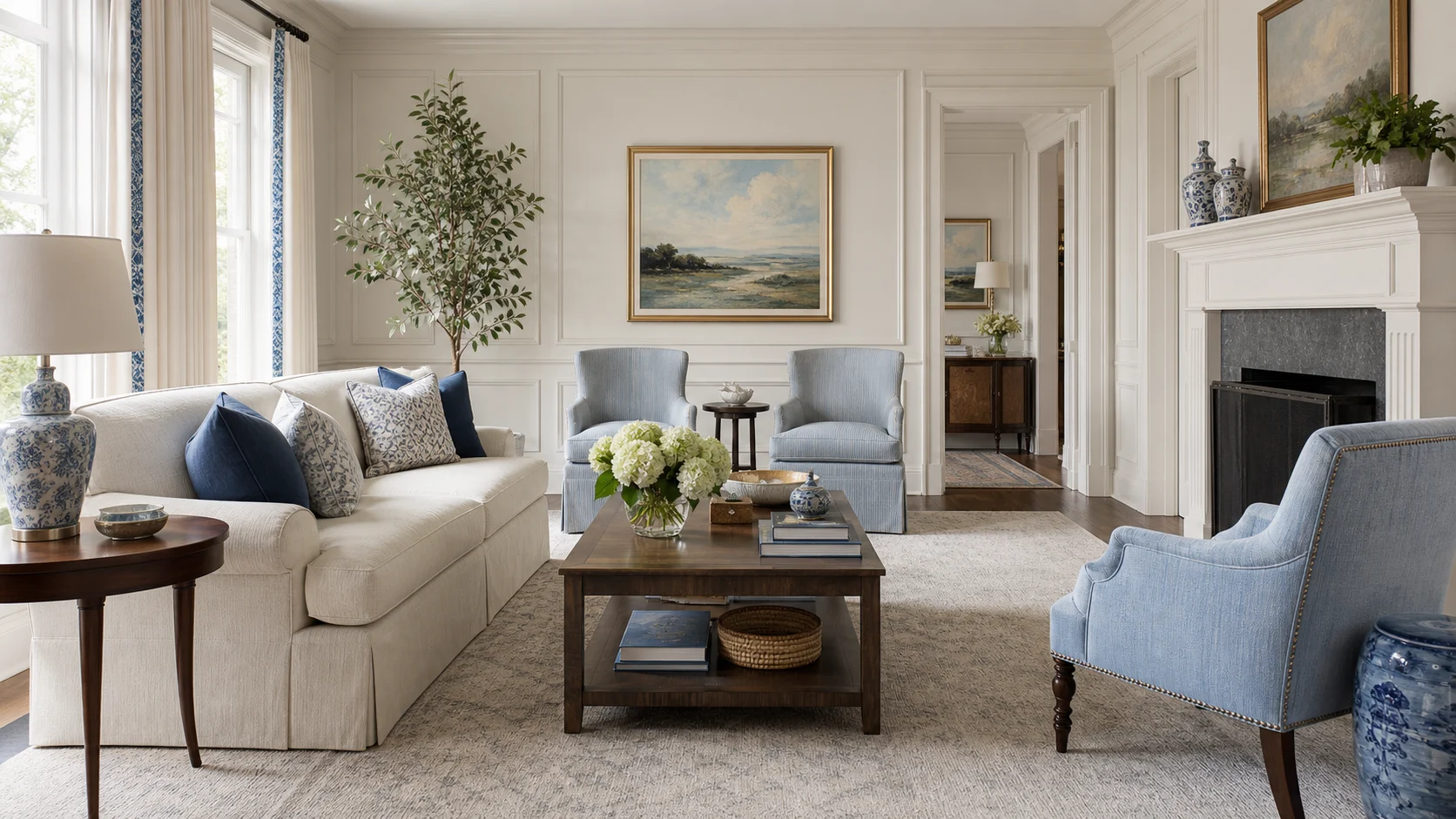
More architectural and broadly tailored, often balancing antiques with abstract art, stronger solids and contemporary upholstery.
Choose Grandmillennial for overt nostalgia, decorative trim and a more playful relationship with familiar domestic pattern.
Chintz, gingham and pleated shades replace the sharper old-new dialogue.
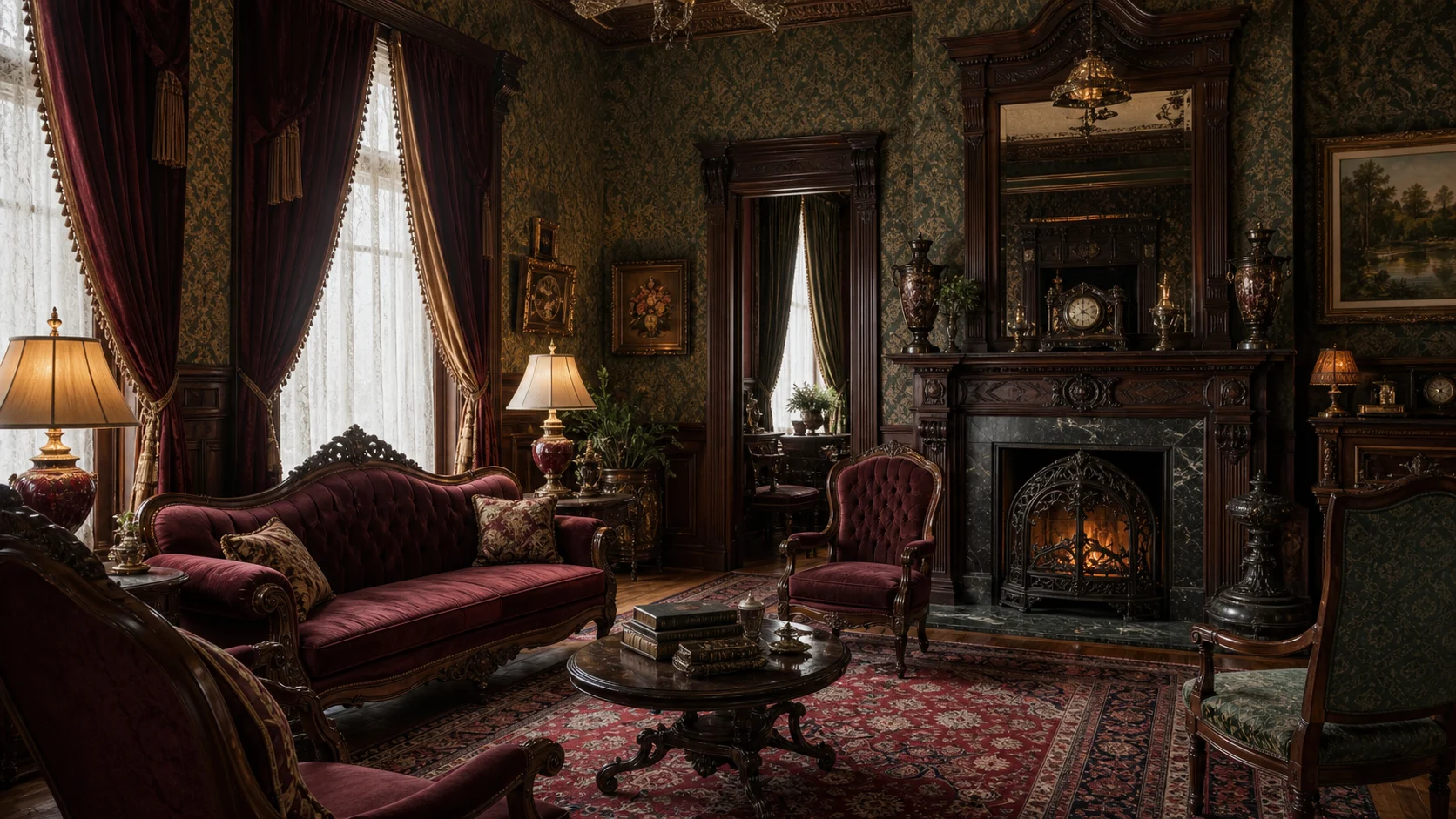
Darker, denser and historically grounded, with divided walls, substantial furniture and several pattern scales across the room.
Choose Grandmillennial for lighter color, cleaner silhouettes and selectively borrowed rather than period-consistent detail.
Bright edited nostalgia replaces nineteenth-century material density.
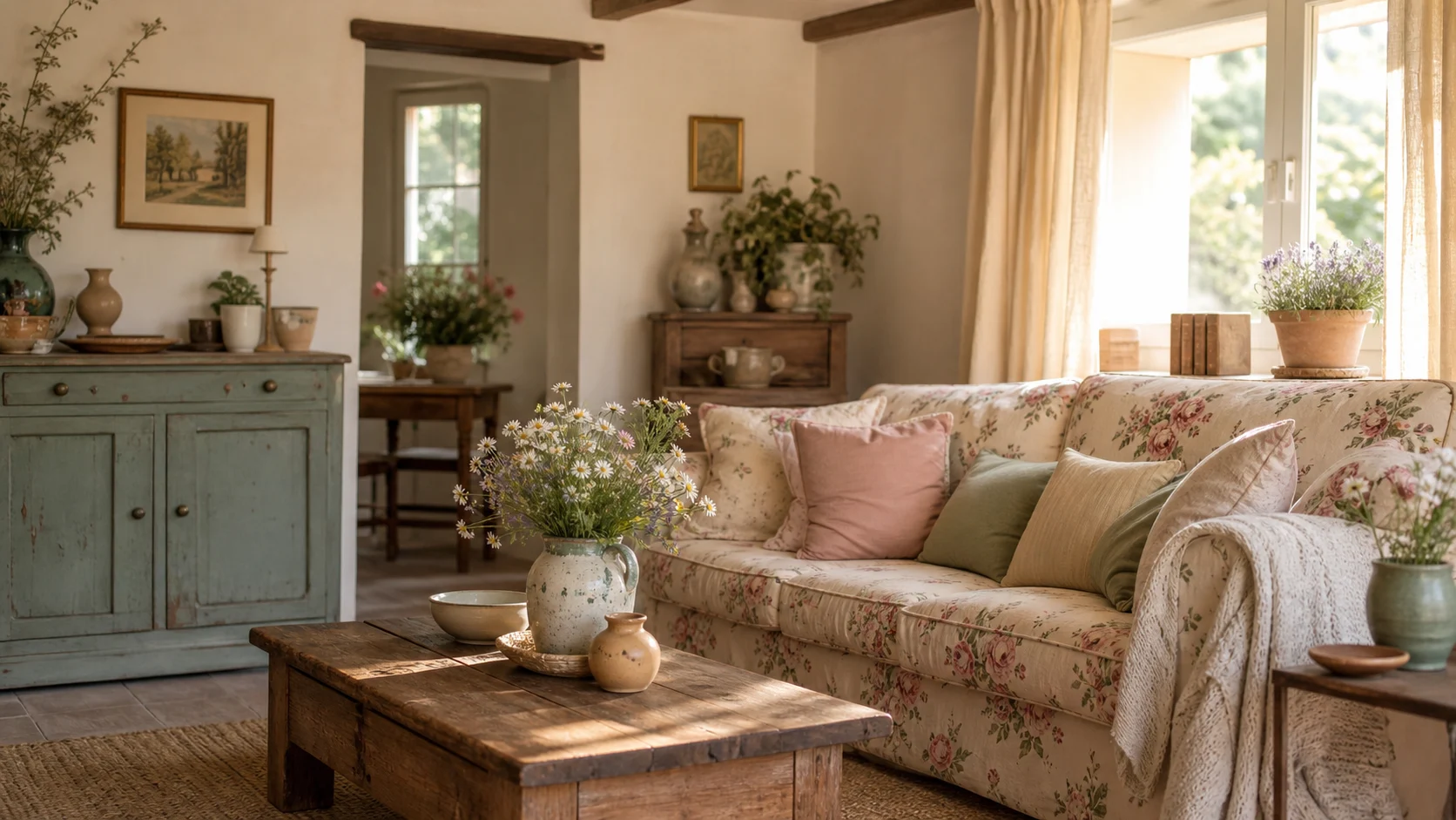
More rural, handmade and romantic, emphasizing pastoral imagery, aged surfaces and an informal country-life narrative.
Choose Grandmillennial for polished antiques, tailored edges and a more urban, decorator-led finish.
Lacquer and formal case furniture replace rustic craft and countryside fantasy.
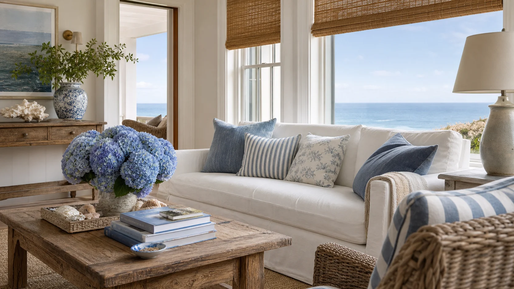
Airier and quieter, using linen, wicker, pale blue and relaxed seaside references with less visible pattern.
Choose Grandmillennial when the room should be brighter, more decorative and deliberately print-driven.
Layered florals and trim replace breezy tonal restraint.
Shop slowly and mix sources. One real antique, a well-printed textile and a contemporary light will create more tension than buying a coordinated nostalgia-themed collection.
Choose a compact repeat and tailored outline so pattern reads clearly from across the room.
Use heritage color on one storage volume instead of spreading it across every cupboard.
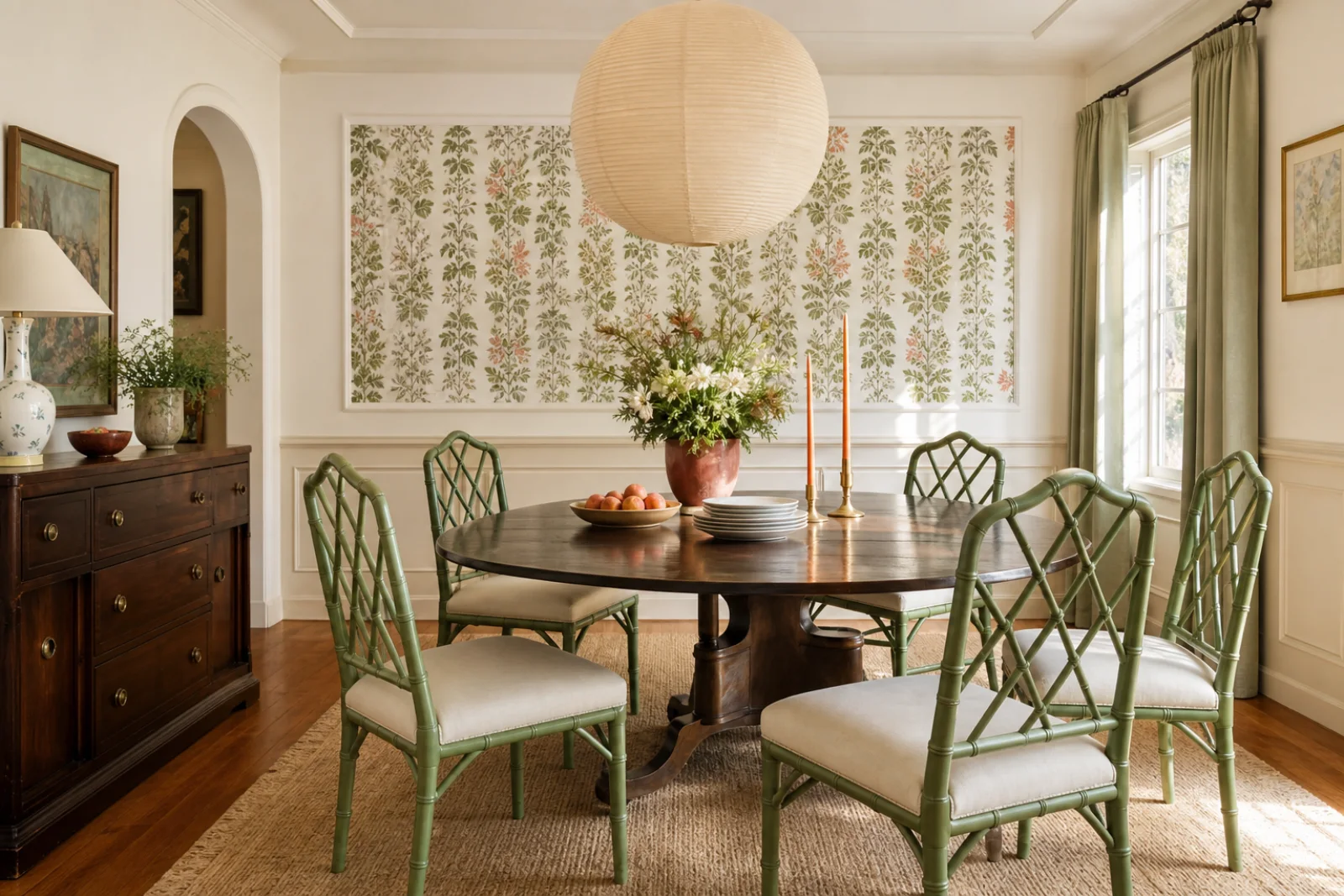
A fresh painted finish turns a familiar silhouette into the room’s contemporary counterpoint.
Check working height and drawer function, then pair it with comfortable current seating.
Use the top as one controlled display and keep drawers available for entry essentials.
Repeat one textile color in the shade, keeping the lamp base simpler than the surrounding pattern.