
Adjustable timber shutters
Match slat angle and finish to the exposure; verify hardware, clearance and airflow when the panels are open.
Filtered light, open air routes and sand-tolerant materials create coastal ease without a single nautical motif.
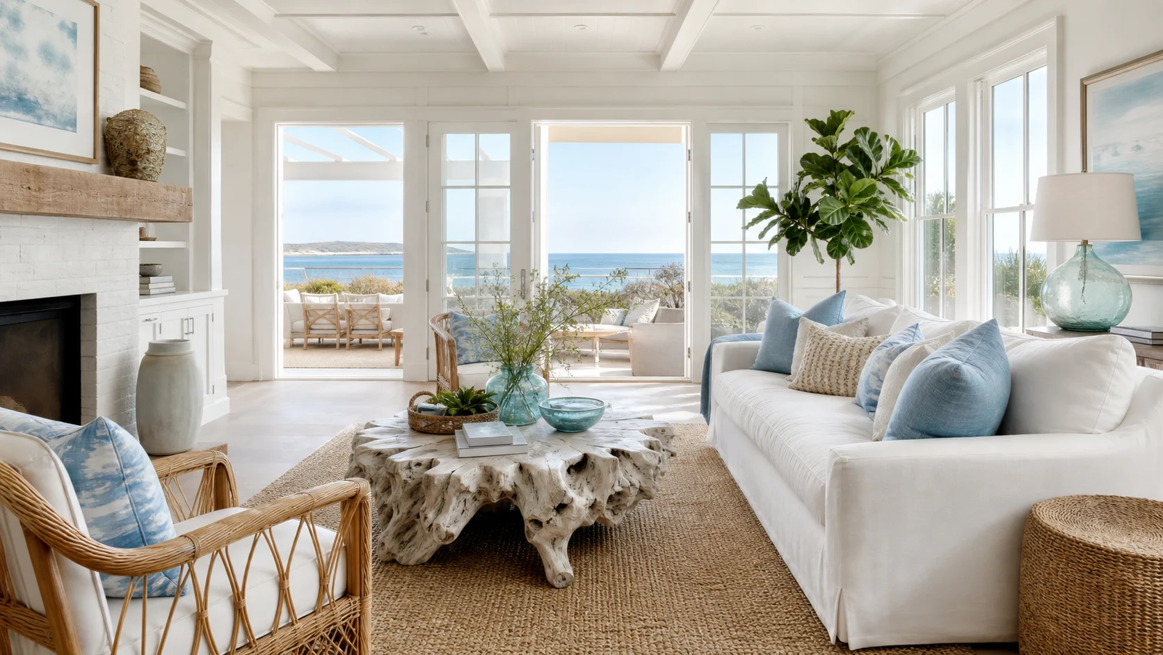
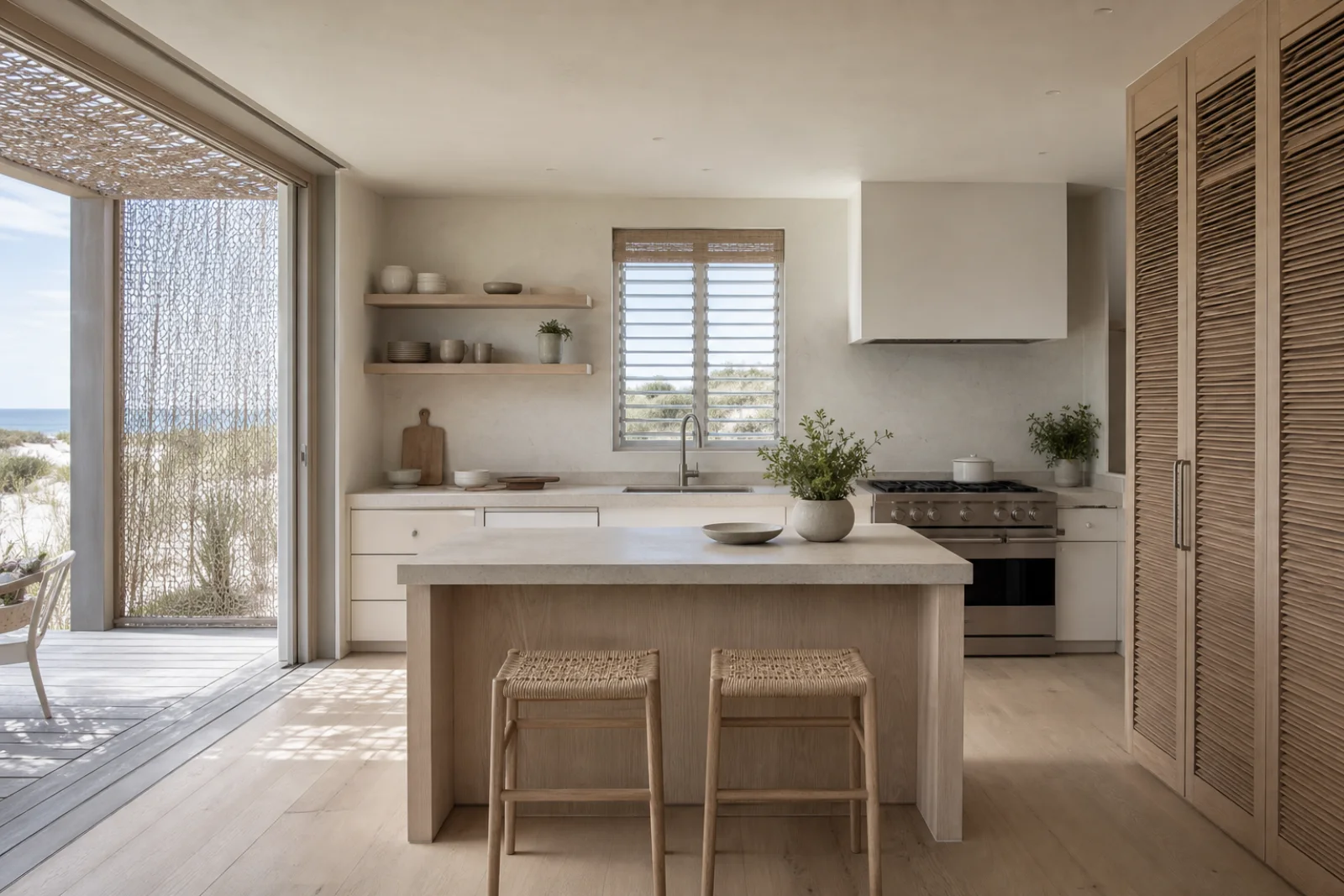
Coastal design responds to the conditions around the shore: intense daylight, views, moving air, wet towels and sand carried indoors. Pale mineral surfaces and light timber support that response, while shutters, screens and washable fabrics make the room comfortable beyond the photograph.
Blue is optional and white needs warmth. A successful palette uses chalk, limestone and bleached oak as the field, then adds a small sea-glass or ink note for depth. This is lighter and more architectural than Coastal Grandmother, less regionally historic than Mediterranean and far more restrained than Tropical style.
Control glare with exterior screens, shutters or lined curtains before choosing pale upholstery.
Connect the outdoor door, rinse point, towel storage and hard floor without crossing the main seating area.
Use limestone, pale oak and natural weave so chalk walls feel dimensional rather than clinical.
Screens and adjustable shutters temper direct light while preserving air and partial views.
Furniture stays out of the line between openings, allowing air to move through the room.
Limestone, oak, linen and seagrass add enough texture that the palette can stay quiet.
Washable slipcovers and removable textiles handle sunscreen, damp clothing and everyday wear.
Keep the view axis open and place washable seating outside the strongest glare; let a woven rug and pale oak warm the white shell.
Use shutters for daytime sun, lined linen for sleep and a low bed so both openings can ventilate the room.
Choose an oval table for easy movement toward the terrace and light woven chairs that dry quickly after humid weather.
Place the screen perpendicular to the window, then add an exterior filter and task light instead of fighting reflections all day.
Specify wipeable pale fronts, a low-sheen stone top and ventilated pantry doors; protect the terrace opening from direct sun.
Keep wet towels, footwear and rinsing on a hard-floor route with ventilated storage before the living space begins.
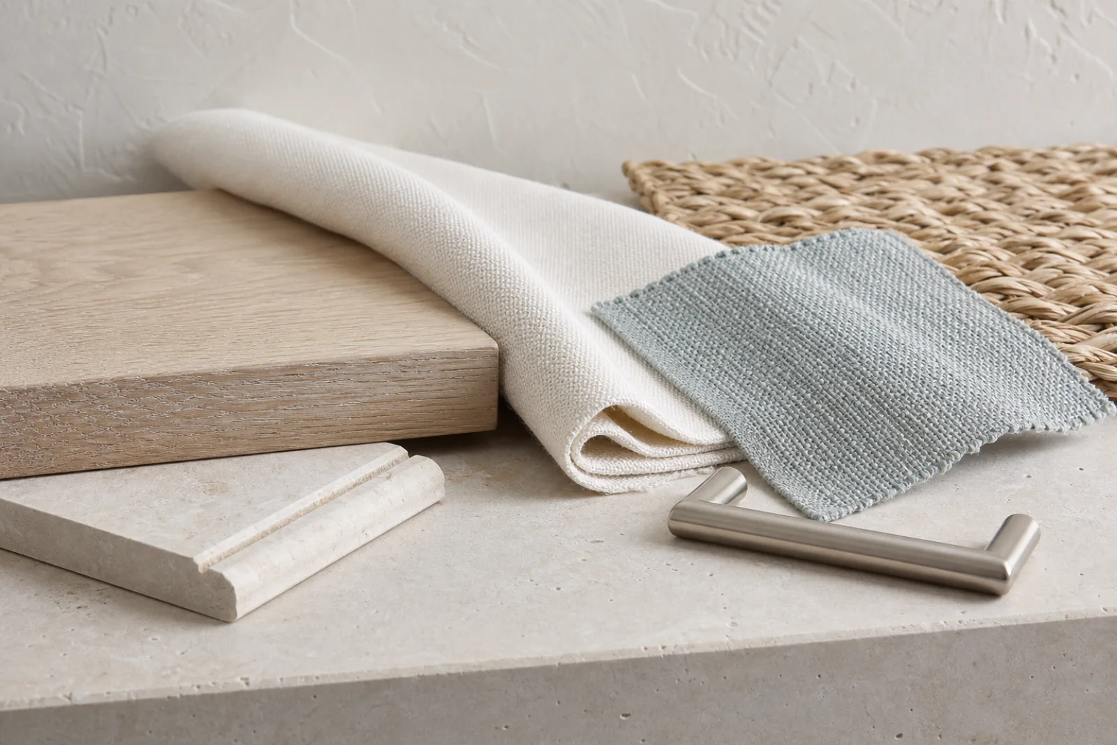
Build most of the room from chalk, limestone and pale oak. Use dune sand to connect the textures, sea-glass grey once or twice and soft ink only where the composition needs an edge.
A softened mineral white that reflects light without turning cold blue.
The mid-tone for weave, flooring and shadow between paler surfaces.
A muted blue-green accent for one cloth plane rather than an entire theme.
Adds dry warmth and visible grain to furniture and screens.
A restrained dark note for art, task surfaces or fine metal lines.
A matte, low-yellow timber that warms the shell; specify a finish appropriate to humidity and exposure.
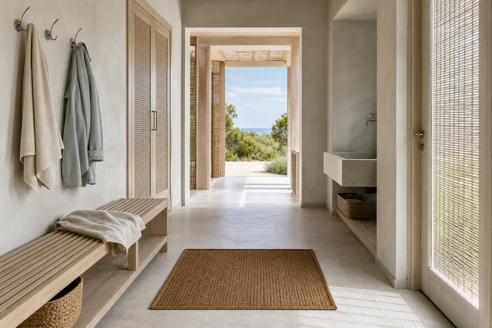
A quiet hard surface for sandy routes when slip rating, sealing and local maintenance are considered.
Keeps the relaxed hand of linen while improving recovery and care in frequently used rooms.
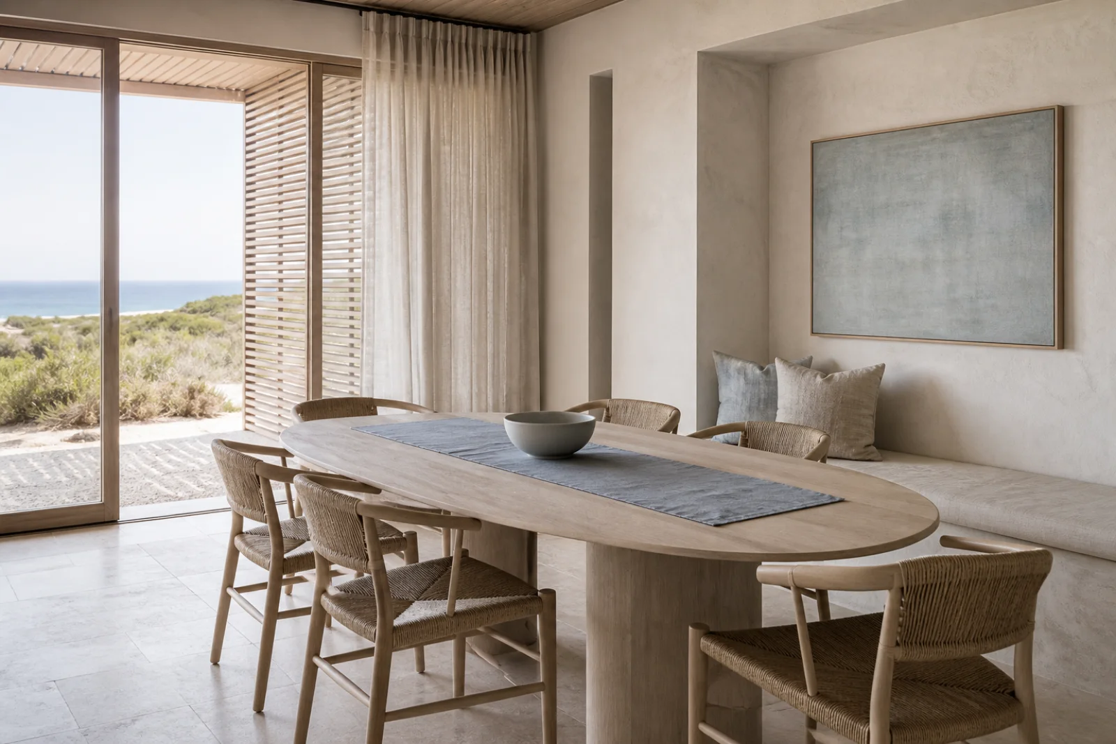
Introduces dry texture on chairs or mats; keep it away from persistently wet zones.
Solve sun, airflow and the path from outdoors first. Then choose three pale materials and one muted color instead of collecting seaside symbols.
Mark when each opening causes heat or glare and choose adjustable protection for that exposure.
Keep tall storage and deep seating clear of the route between operable windows and doors.
Combine one mineral, one pale wood and one washable cloth before adding blue.
Give sand, towels and wet shoes a short hard-surface path with ventilation and easy cleaning.
When the room feels wrong, change the underlying decision before adding more decor.
Add exterior shade, dune mid-tones and pale timber before increasing decorative contrast.
Keep sea-glass color to one textile plane and let mineral neutrals carry the room.
Move seagrass and rattan inward; use stone, tile and suitable metal beside exterior doors.
Remove shells, anchors and signs; express place through light control, views and material performance.
Coastal is not simply a pale palette. Its identity comes from solving shore conditions—sun, air, humidity and sand—with a quieter material and furniture language.
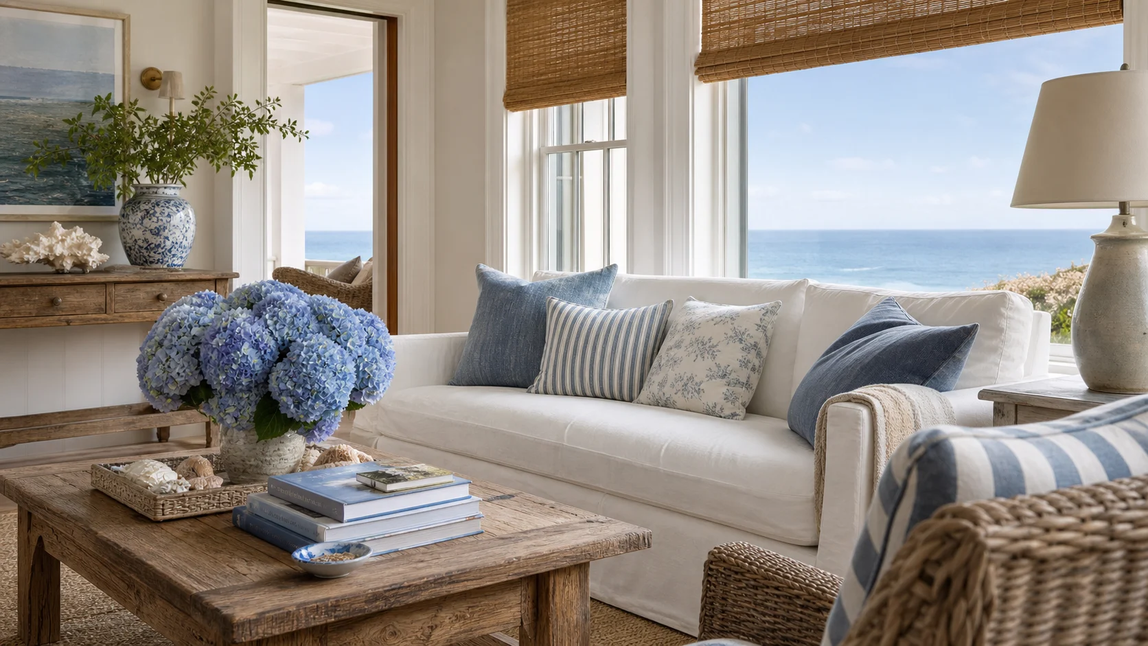
More traditional and layered, with slipcovered comfort, woven antiques, soft blue and familiar New England references.
Choose Coastal for cleaner architecture, stronger sun control and less nostalgic furnishing.
Slatted screens and limestone replace traditional layers.
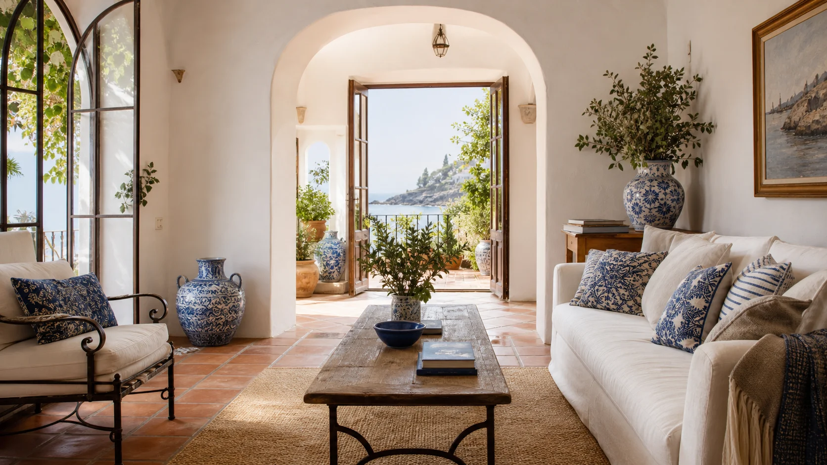
Warmer and more historic, using lime plaster, terracotta, arches and stronger regional craft.
Choose Coastal for a cooler, lighter envelope with pale timber and restrained geometry.
Dune neutrals replace baked clay and ornamental tile.
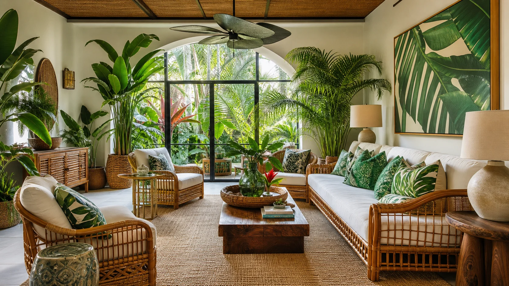
Lusher and more saturated, with broad-leaf greenery, dark or golden timber and stronger woven contrast.
Choose Coastal for dry texture, muted vegetation and lower color intensity.
Sea grass and pale oak replace palms and dense tropical color.
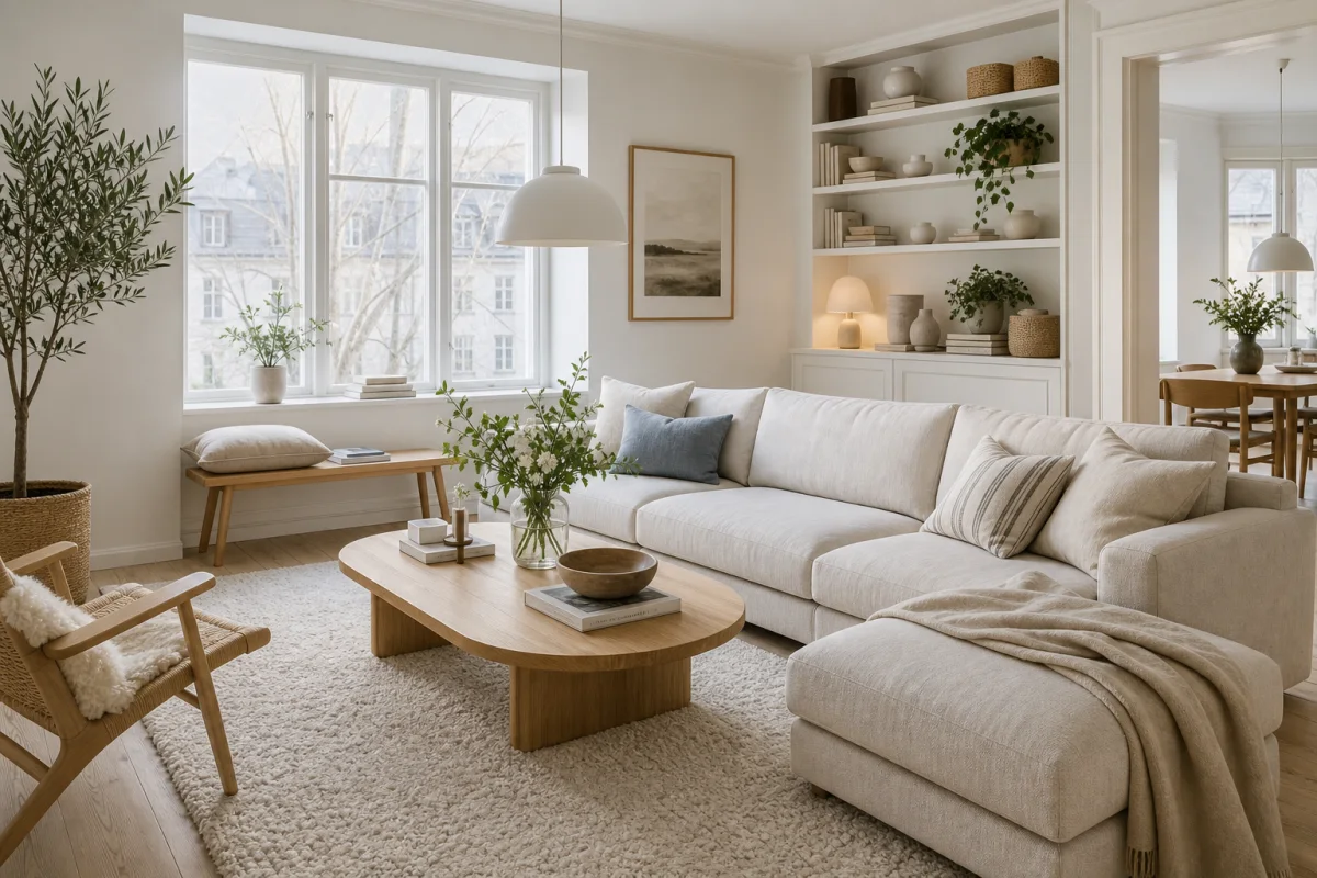
Similarly light but more inland and domestic, emphasizing Nordic practicality, wool and crisp pale-wood furniture.
Choose Coastal when glare, salt air, sand and outdoor wet routes are the real design constraints.
Shutters and rinse storage replace winter-focused softness.
Buy for exposure and maintenance before appearance. Verify cleanability, corrosion resistance and sun performance for the exact location rather than trusting a “coastal” label.
Match slat angle and finish to the exposure; verify hardware, clearance and airflow when the panels are open.
Review stain sensitivity, sealing and glare under direct daylight before selecting a pale slab.
Check seat comfort and whether the fiber suits indoor humidity; avoid leaving natural weave exposed outdoors.
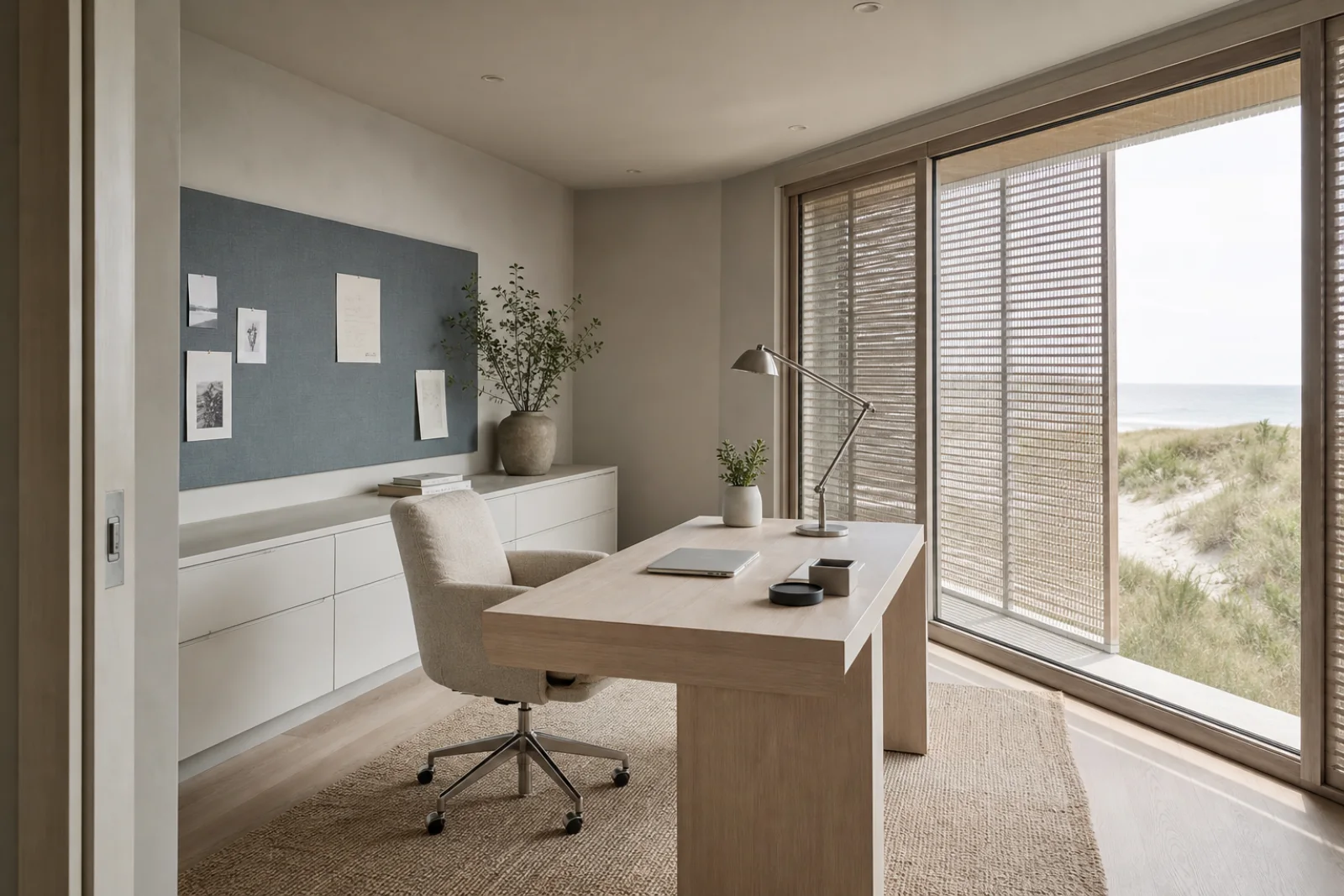
Size the desk around a screen perpendicular to the window and include cable routing plus a real task light.
Provide air gaps and washable internal surfaces so damp textiles are not sealed into a shallow cabinet.
Confirm the metal grade and coating for interior, sheltered exterior or direct salt exposure—these are not interchangeable.