Pod lounge chair
Use a single enclosed shell as the focal seat and keep surrounding furniture lower-key.
An optimistic past imagining the future through capsule curves, molded forms, chrome reflections and color borrowed from the Space Age.
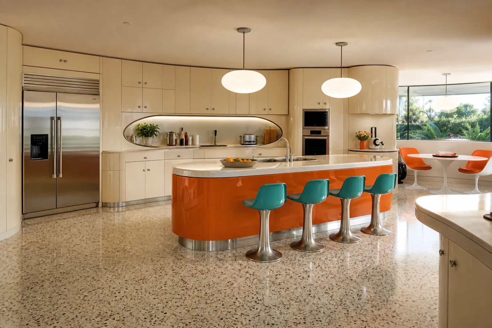
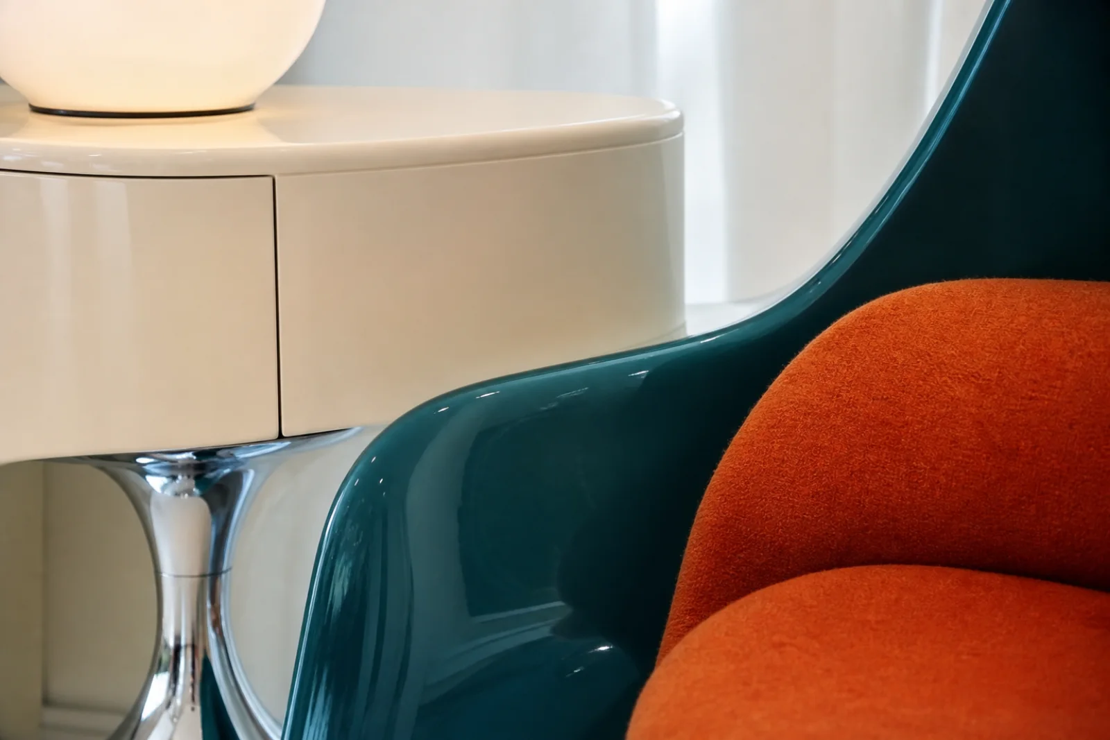
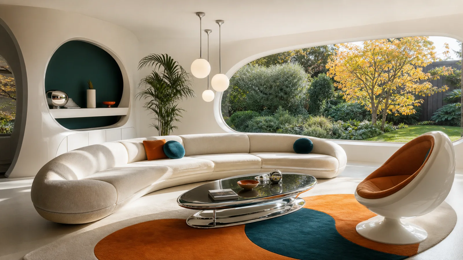
Retrofuturism looks back at how earlier decades imagined life ahead. In interiors, it draws especially from Atomic Age and Space Age design: molded shells, pod chairs, saucer lights, capsule niches, bright lacquer, chrome and optimistic color. The appeal is not technological accuracy but the confidence and playfulness of those predictions.
A livable version needs editing. One curved sofa, pod chair or oval cabinet can establish the idea; repeating every possible porthole, globe and metallic surface turns a home into a theme set. Familiar textiles, ordinary windows and practical storage keep the speculative forms grounded in daily life.
The style references yesterday’s predictions rather than today’s actual smart-home technology.
Rounded furniture and capsule openings matter more than decorative rockets or sci-fi props.
Cream and white open the room while orange, teal or yellow gives the composition energy.
Fiberglass shells, rounded lacquer cabinets and pod seating create seamless, product-like silhouettes.
Reflective pedestals and diffused glass recall the precision and optimism of Space Age products.
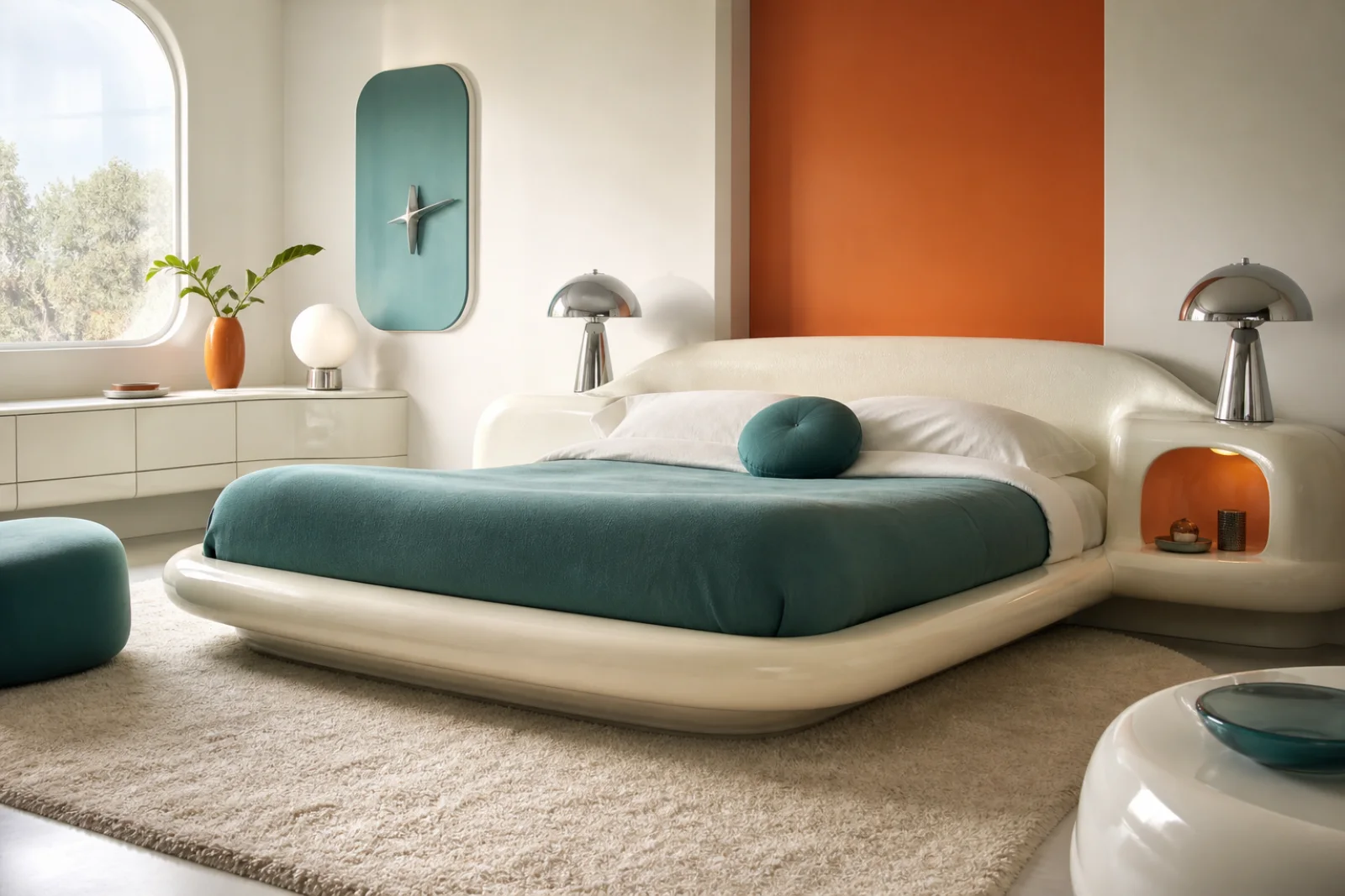
Burnt orange, teal and cream define broad shapes instead of appearing as many small accessories.
Oval niches, radiused corners and rounded windows extend the furniture language into the room.
Choose one pod chair or crescent sofa; keep the rest of the seating quieter.
Use a rounded bed or capsule niche, then limit chrome and color around it.
Let one saucer pendant and pedestal table establish the Space Age reference.
A curved lacquer desk can lead while storage remains practical and readable.
Apply orange or teal to one island or cabinet band rather than every surface.
One oval coat niche makes the idea clear without altering every doorway.
Let cream and white occupy most of the room, then pair one warm accent with one cooler counterpoint. Chrome should reflect the colors rather than become a separate theme.
The soft light base that keeps molded white forms from feeling clinically bright.
A broad, energetic accent for one wall panel, island, rug shape or upholstered form.
A cooler counterweight that gives orange and chrome more depth.
Use on pedestals, lamp stems and fine furniture edges, not every available surface.
Connects glossy shells, ceilings and rounded architecture without adding another hue.
A continuous shell allows pod chairs and rounded furniture to read as single futuristic objects.
Best on one curved cabinet or island; extensive gloss creates glare and weakens the shape.
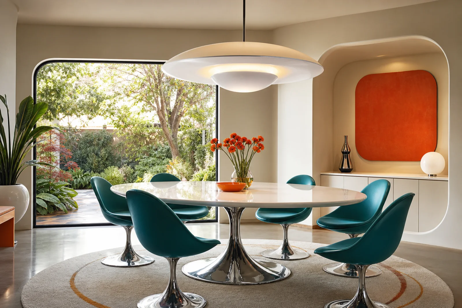
Reflective bases make tables and chairs feel lighter while reinforcing the product-design influence.
Wool in orange or teal adds acoustic softness and makes molded shells comfortable.
Treat retrofuturism as a strong accent language. Establish one memorable form, then support it with space, color and ordinary function.
Focus on Atomic or Space Age references instead of mixing every sci-fi decade.
Begin with a sofa, pod chair, pedestal table or capsule cabinet—not all four.
Use orange and teal in broad controlled areas rather than scattered novelty objects.
Keep windows, textiles, storage and circulation familiar and genuinely useful.
When the room feels wrong, change the underlying decision before adding more decor.
Remove props and let furniture geometry communicate the concept.
Add wool, matte walls and soft upholstery between lacquer and chrome.
Keep one dominant oval or dome and simplify the smaller fixtures.
Use cleaner cream shells and chrome; reduce brown, velvet and smoked glass.
Retrofuturism is not simply a futuristic room. Its identity comes from historical predictions of the future, especially the optimistic Space Age language of the mid-twentieth century.
More credible, engineered and focused on present-day integrated systems.
Choose retrofuturism when the emotional appeal is playful historical imagination rather than actual automation.
Capsule curves and orange/teal color replace smart glass, sensors and technical panels.
Earthier, lower and richer in walnut, velvet, smoked glass and pattern.
Choose retrofuturism for whiter shells, brighter contrast and a more explicitly Space Age silhouette.
Chrome pedestals and molded fiberglass replace dark wood and lounge-like upholstery.
More practical, timber-led and grounded in postwar furniture production.
Choose retrofuturism if molded shells and speculative shapes matter more than teak casegoods and tapered legs.
Pod seating and lacquered curves replace leggy walnut furniture.
More luxurious, symmetrical and rooted in 1920s–30s geometry and ornament.
Choose retrofuturism for informal curves, synthetic materials and optimistic pop color.
Use fiberglass, chrome and opal globes instead of marble, brass and stepped motifs.
One convincing silhouette is more useful than a collection of novelty objects. Look for functional pieces whose construction naturally creates the futuristic form.
Use a single enclosed shell as the focal seat and keep surrounding furniture lower-key.
An integrated curved headboard creates the mood without themed bedding or props.
A central pedestal removes leg clutter and strengthens the floating product-like silhouette.
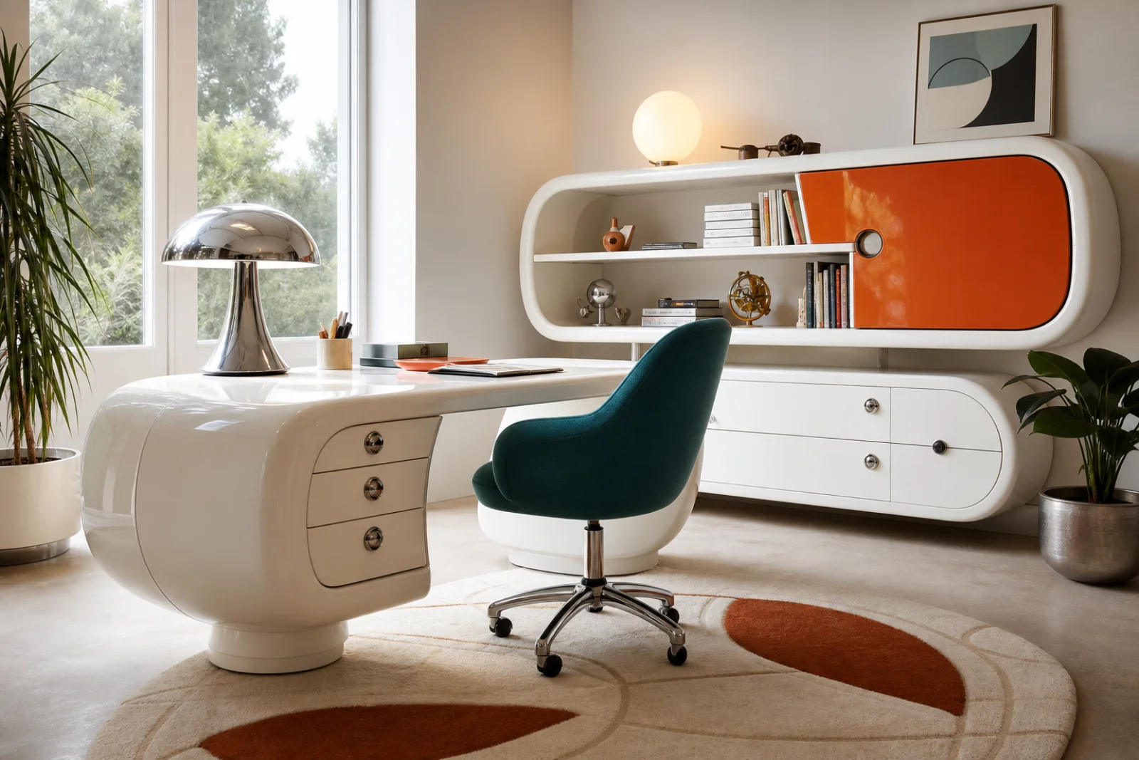
Rounded lacquer storage can be playful while still organizing books and work materials.
One orange or teal cabinet volume carries more impact than many small retro accessories.
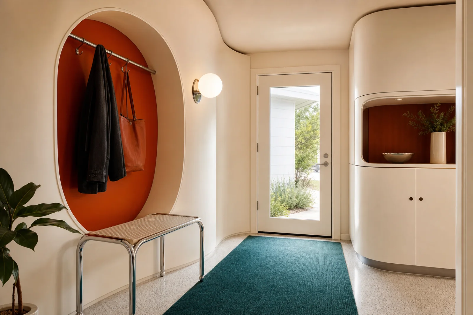
A single diffused sphere introduces the era quietly and provides practical arrival light.